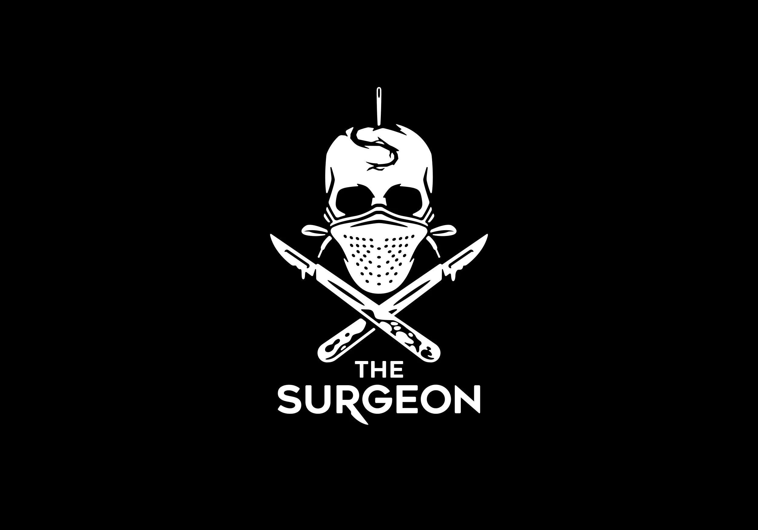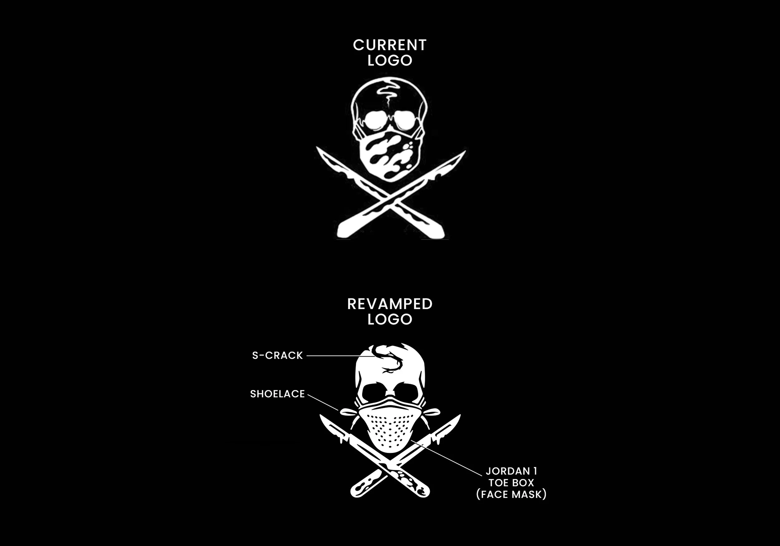
THE SHOE SURGEON
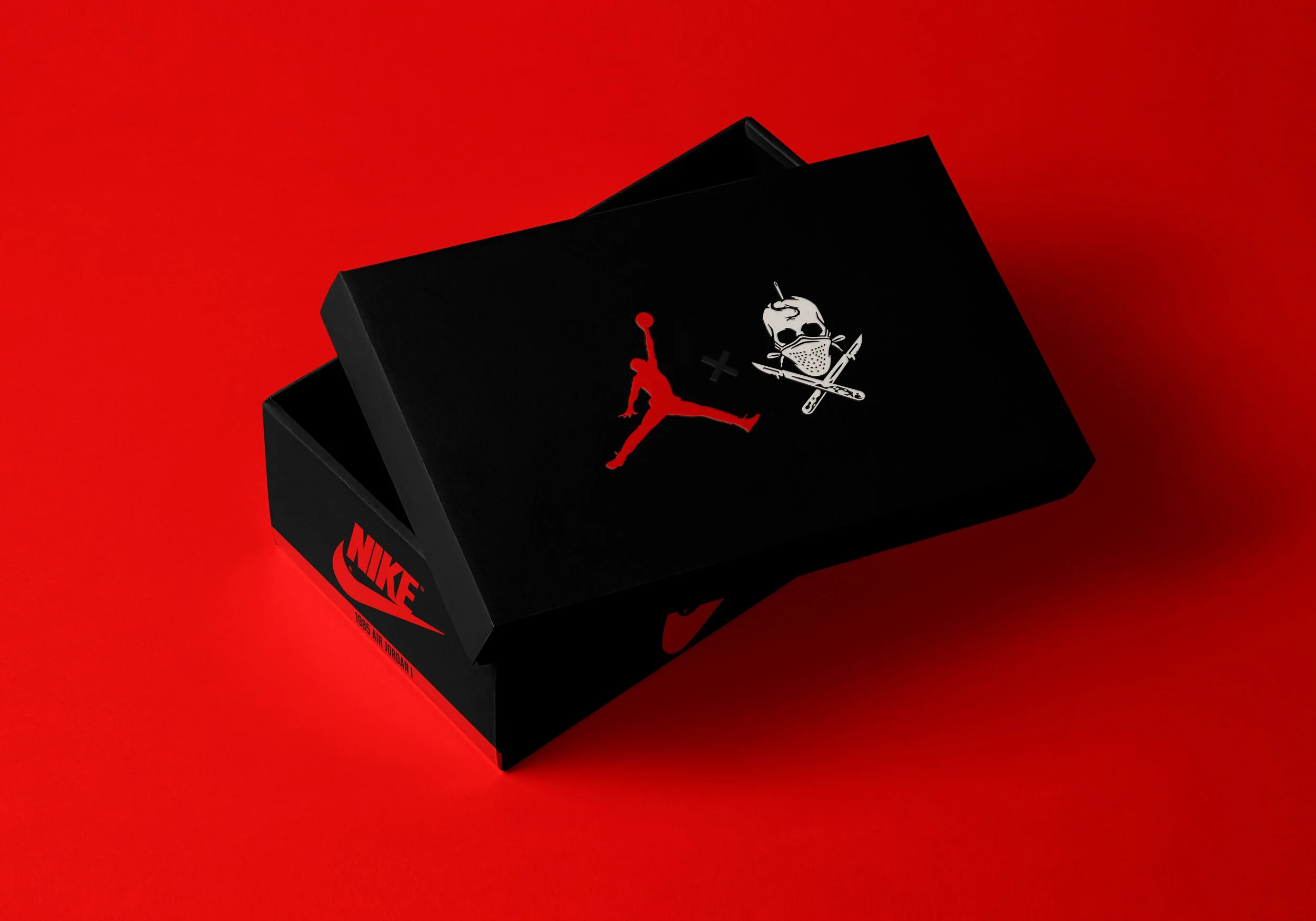
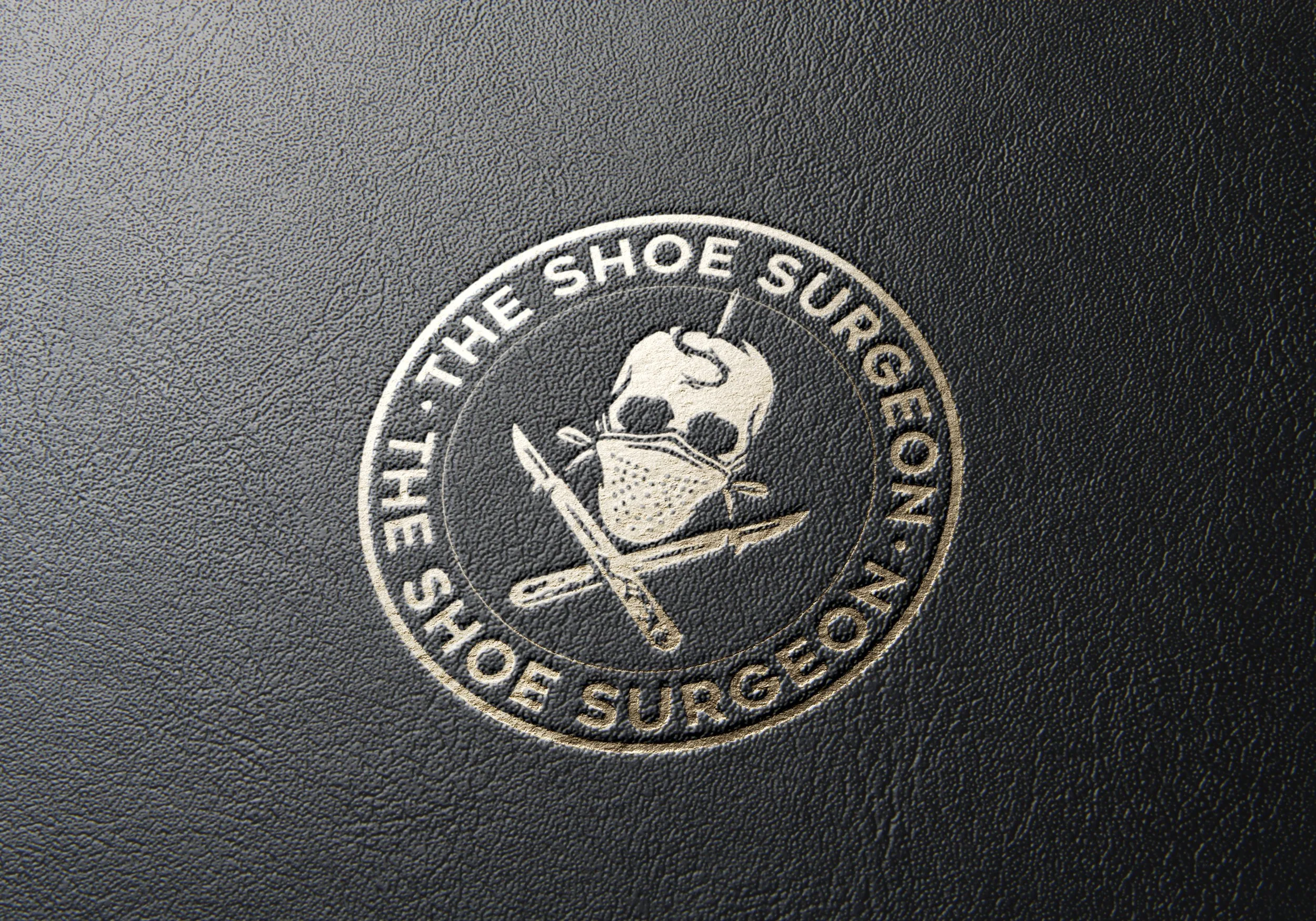
As a longtime admirer of The Shoe Surgeon’s work, I reimagined his logo as a thoughtful evolution of an already recognizable mark. The original skull-and-mask concept is strong, but I inverted the black-and-white values to correct visual hierarchy and create stronger depth and readability. I also removed the outer white stroke, allowing the mark to feel more refined and adaptable across digital, apparel, and product applications. The goal was to preserve the identity’s edge while elevating its professionalism to match the caliber of clients he serves — from athletes to celebrities. The result is a cleaner, more authoritative interpretation that aligns the logo with the craftsmanship behind the brand.