Arquero Coffee Co.
Brand Identity & Environmental Design
-
Arquero Coffee Co. began as a startup with one certainty: the name.
Beyond that, the founder had no defined visual direction, positioning, or identity system. My role was to translate a single word into a cohesive brand — spanning identity, slogan development, packaging, and web experience.
Arquero, Spanish for Archer, reflects the founder’s surname and became the conceptual anchor for the entire system.
The objective was to create a brand that felt organic, humble, and source-driven — yet sharp, confident, and distinctive.
-
At inception, Arquero was undefined.
No logo.
No visual language.
No packaging.
No web presence.The opportunity was wide open — but so was the risk of creating something generic in a saturated coffee market.
Craft coffee branding often leans heavily into:
• Rustic typography
• Overly ornate illustration
• Minimalist sterility
• Trend-driven aestheticsArquero needed clarity of concept before aesthetics.
-
The name itself presented a strategic advantage.
Arquero = Archer.
Precision. Aim. Intention.
Coffee is judged in moments of taste.
Archery is judged in moments of precision.The opportunity was to build a brand system rooted in that metaphor:
• Every decision deliberate
• Every roast purposeful
• Every cup preciseThe positioning became clear:
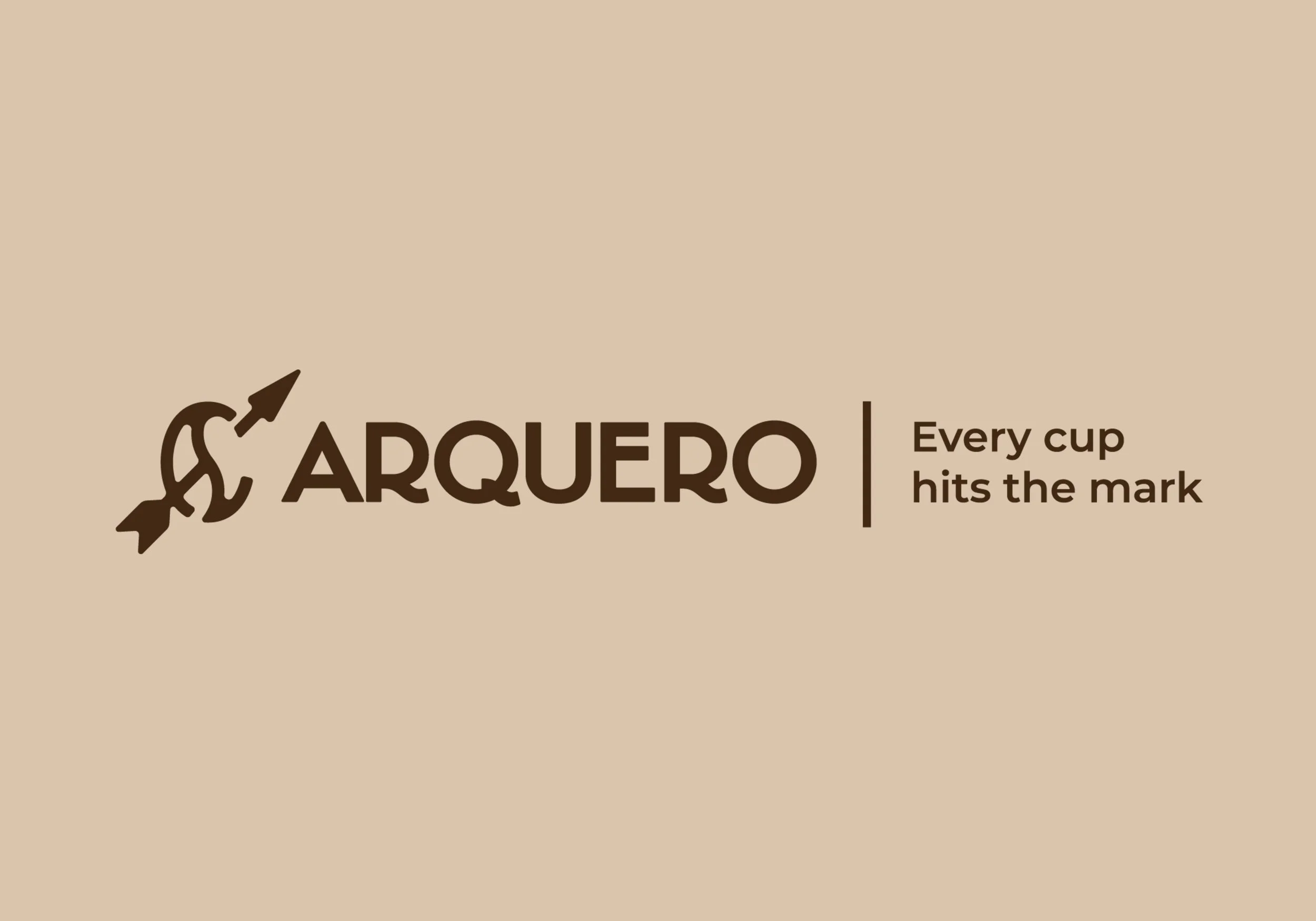
A coffee brand that hits the mark — every time.
-
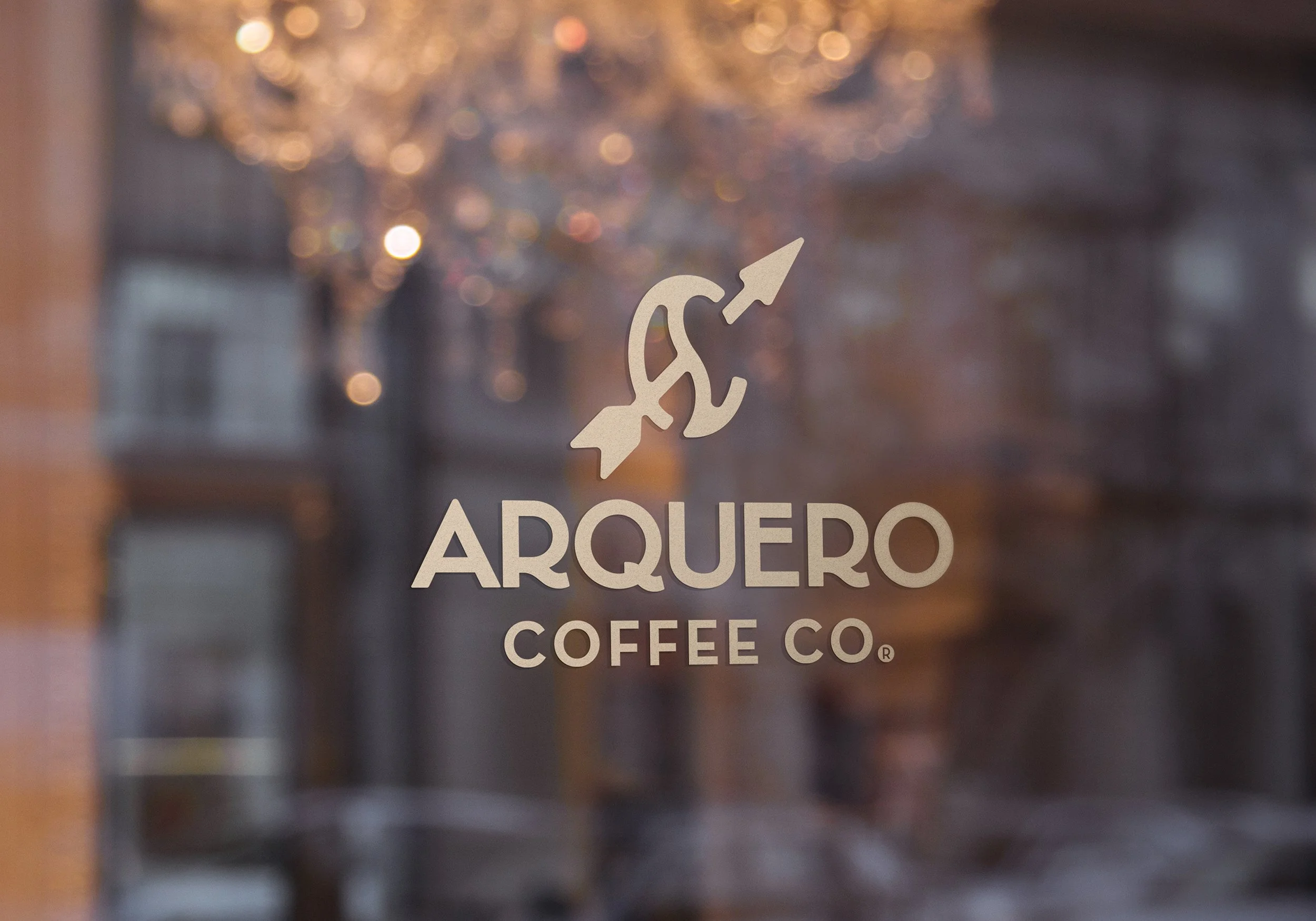
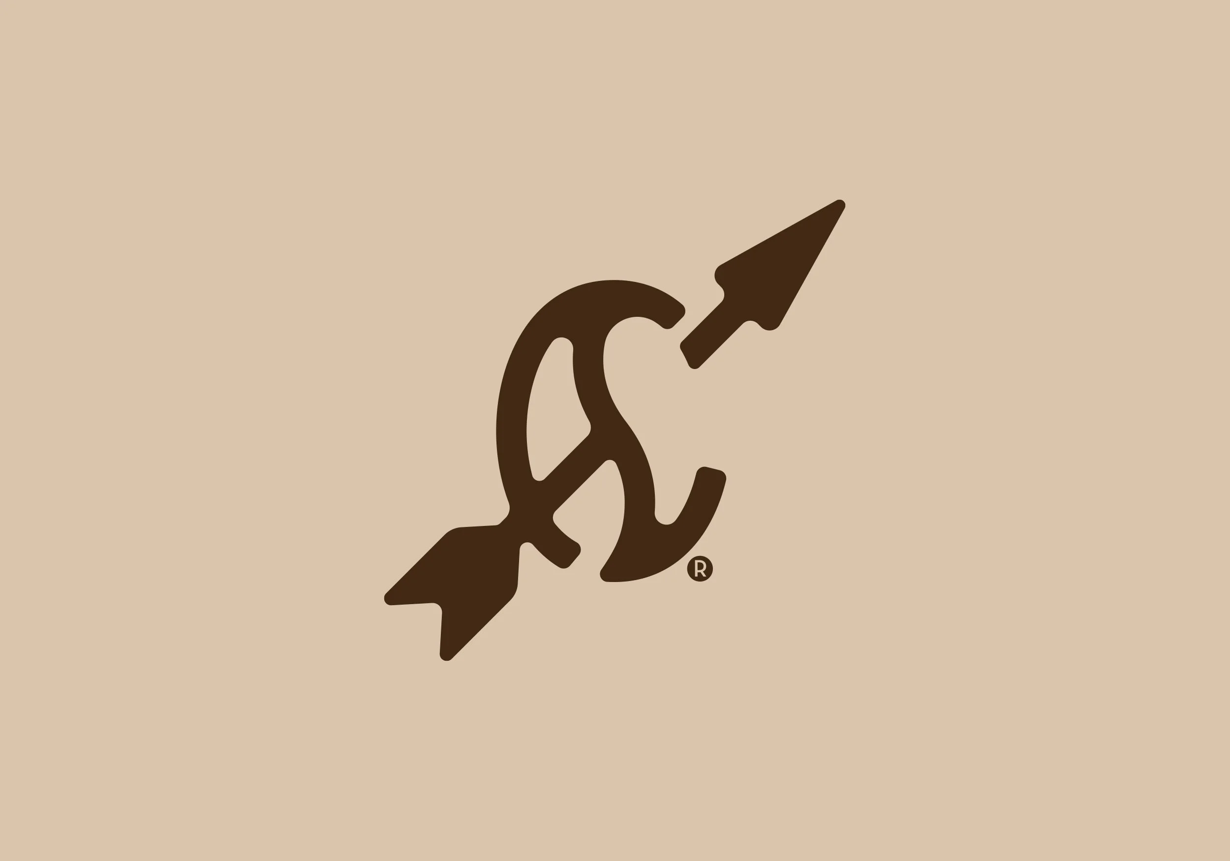
CLARITY
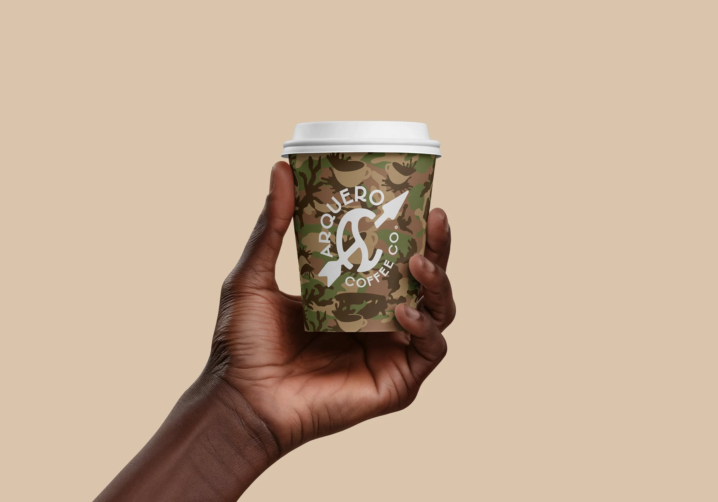
The visual identity was built from symbolic integration.
The primary mark combines:
• An arrow
• A coffee bean
• The initials AC (Arquero Coffee)These elements were simplified into a cohesive form — classic in proportion, modern in execution.
The result feels timeless, not trendy.
The logo system was designed responsively, ensuring clarity across packaging, digital, and merchandise applications.
CARE
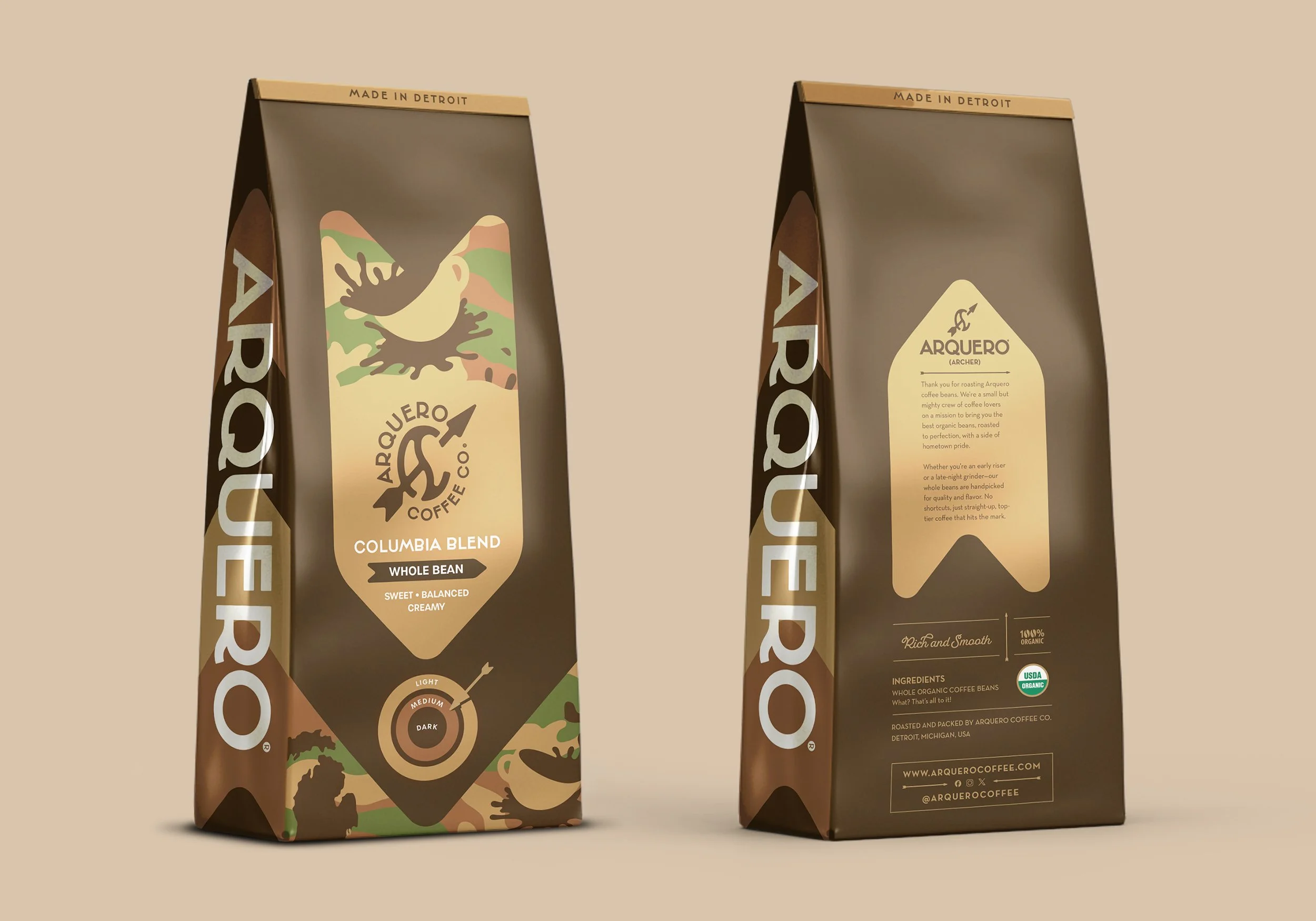
The color palette leans into organic browns, creams, and deep greens — grounded in the natural origins of coffee.
Subtly, these tones evolved into a camouflage-inspired pattern — a restrained nod to the archer’s connection to terrain and precision in the field.
This detail is not loud.
It’s intentional.Packaging design was developed for whole bean varieties sourced directly from Colombia and Brazil.
Each roast level is communicated using a target system:
The darker the roast, the closer to the bullseye.
A simple arrow indicates intensity.This creates:
• Visual consistency
• Immediate product clarity
• Conceptual reinforcementThe packaging is sleek and minimal, allowing the symbolism to carry the narrative without clutter.
ELEVATION
The brand extends beyond visuals.
The slogan —
“Every cup hits the mark.”This line reinforces:
• Precision
• Satisfaction
• Confidence
• CraftIt speaks to discerning coffee drinkers without arrogance.
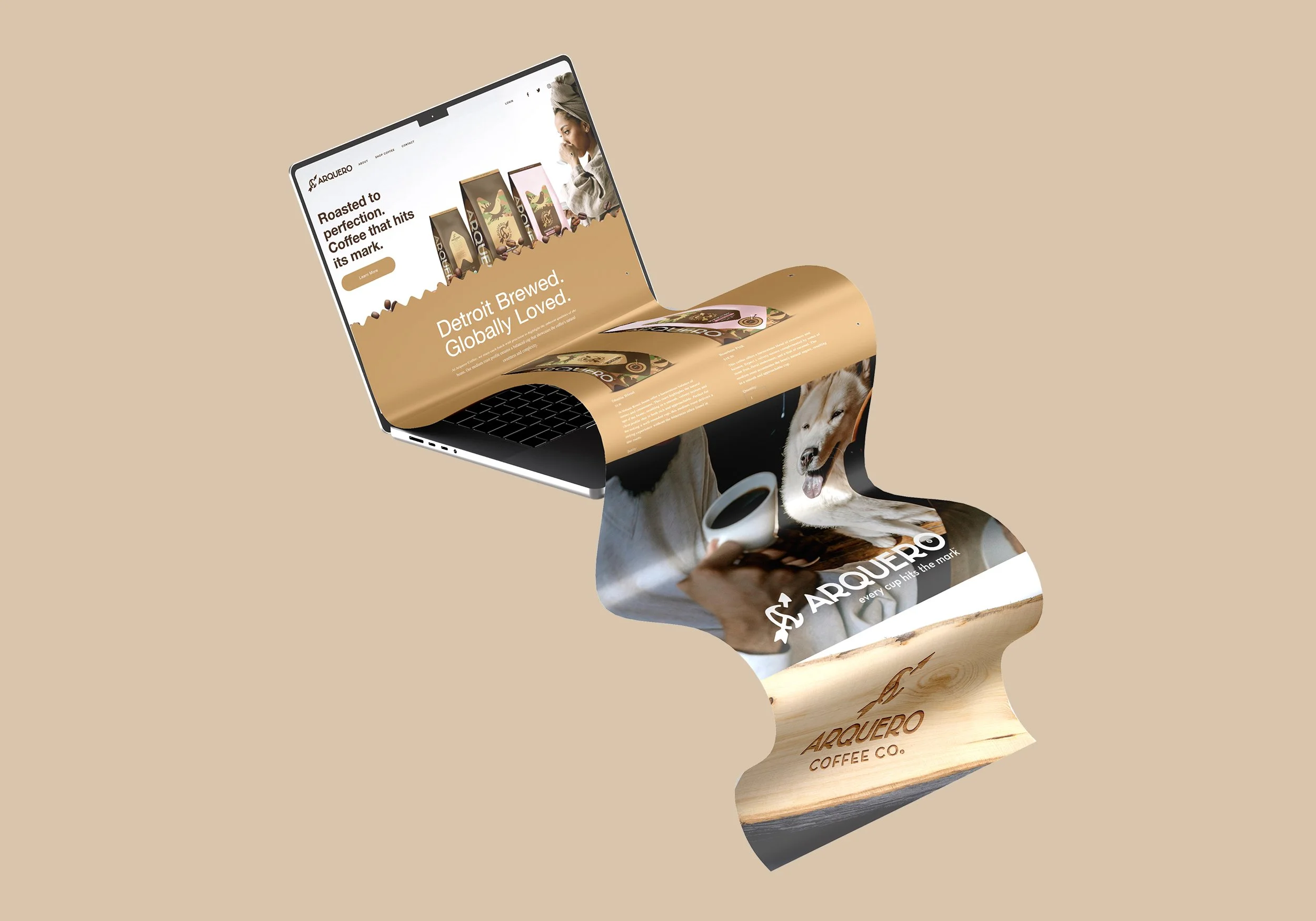
The website, currently in development, mirrors the brand’s restraint — clean layouts, thoughtful hierarchy, and emphasis on origin stories.
The founder personally travels to farms in South America, working directly with growers and selecting beans at the source. The identity supports that authenticity — organic, grounded, and intentional.
-
• Primary logo mark
• Secondary and submark variations
• Monochrome applications
• Color palette & camouflage pattern
• Packaging mockups (Colombia / Brazil varieties)
• Roast level target system
• Website wireframes
• Slogan integration
• Merchandise applicationsThe system was designed to scale — from local Detroit rollout to potential regional growth.
-
Arquero Coffee Co. launched not as another craft brand chasing trends, but as a concept-driven identity rooted in metaphor and clarity.
From a single name, the brand now communicates:
• Precision
• Integrity
• Source authenticity
• Humble confidenceThe identity holds together across packaging, web, and storytelling — positioning Arquero as intentional from the ground up.
-
Strong brands begin with alignment.
Arquero began with a name — and became a system.
Every element was designed to reinforce one idea:
Every cup hits the mark.
Built with intention.
Made with Marcus.