Detroit Hives
Brand Identity System and Ongoing Creative Direction
-
Detroit Hives is a Detroit-based community organization transforming vacant lots into pollinator-friendly urban gardens while educating the public on the importance of bees, biodiversity, and environmental stewardship.
Since 2016, I have partnered with Detroit Hives as their marketing consultant and lead designer — developing their brand identity and building a visual system that supports growth, funding, and public visibility.
This engagement began at the grassroots level and evolved into a long-term creative partnership.
-
When Detroit Hives began, the mission was clear — but the visual presence was undefined.
They were turning vacant land into flourishing green spaces. They were educating the community. They were building something real.
But without a cohesive brand system, their ability to attract funding, volunteers, and long-term partnerships would be limited.
The opportunity was not decoration. It was foundation.
-
Detroit Hives didn’t need hype.
They needed credibility.A brand that could:
Stand confidently in front of grant committees
Engage the local community
Attract volunteers
Compete visually with larger environmental organizations
Communicate consistency across signage, print, and digital platforms
The goal was alignment — building a system that reflected their impact and supported long-term growth.
-
CLARITY
We established a clear visual identity rooted in accessibility, community, and environmental stewardship.
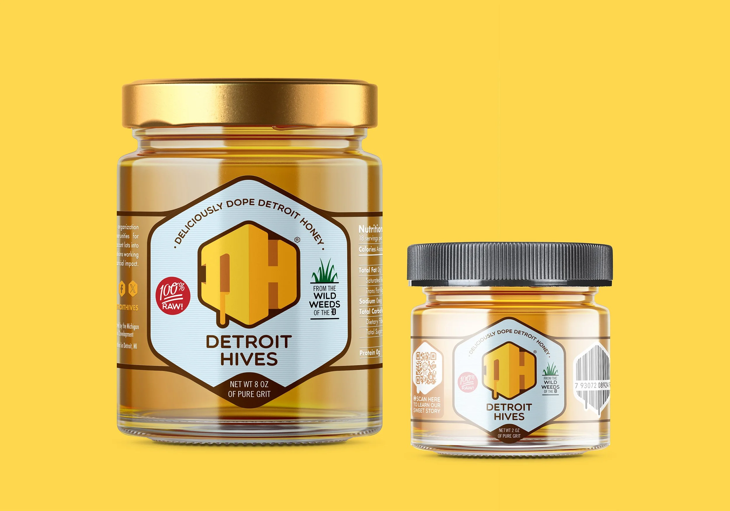
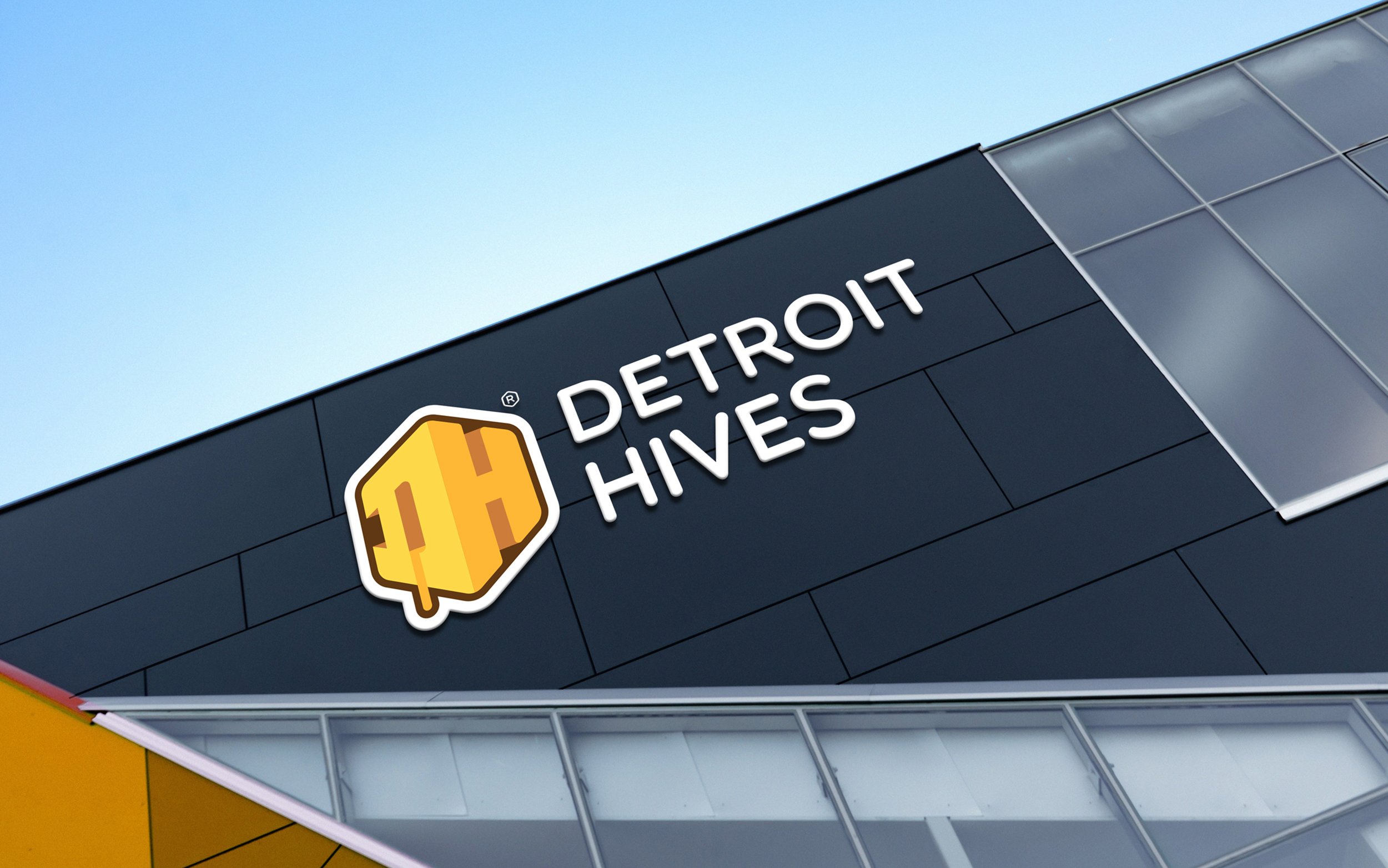
A logo system designed for scalability. Typography built for legibility across outdoor signage and digital platforms. A color system that felt organic yet structured.
From the beginning, every decision considered both grassroots authenticity and institutional credibility.
CARE
The work extended far beyond a logo.
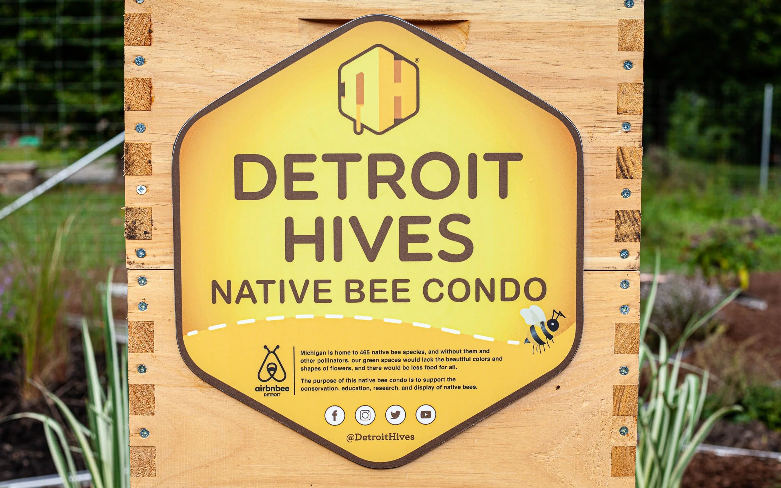
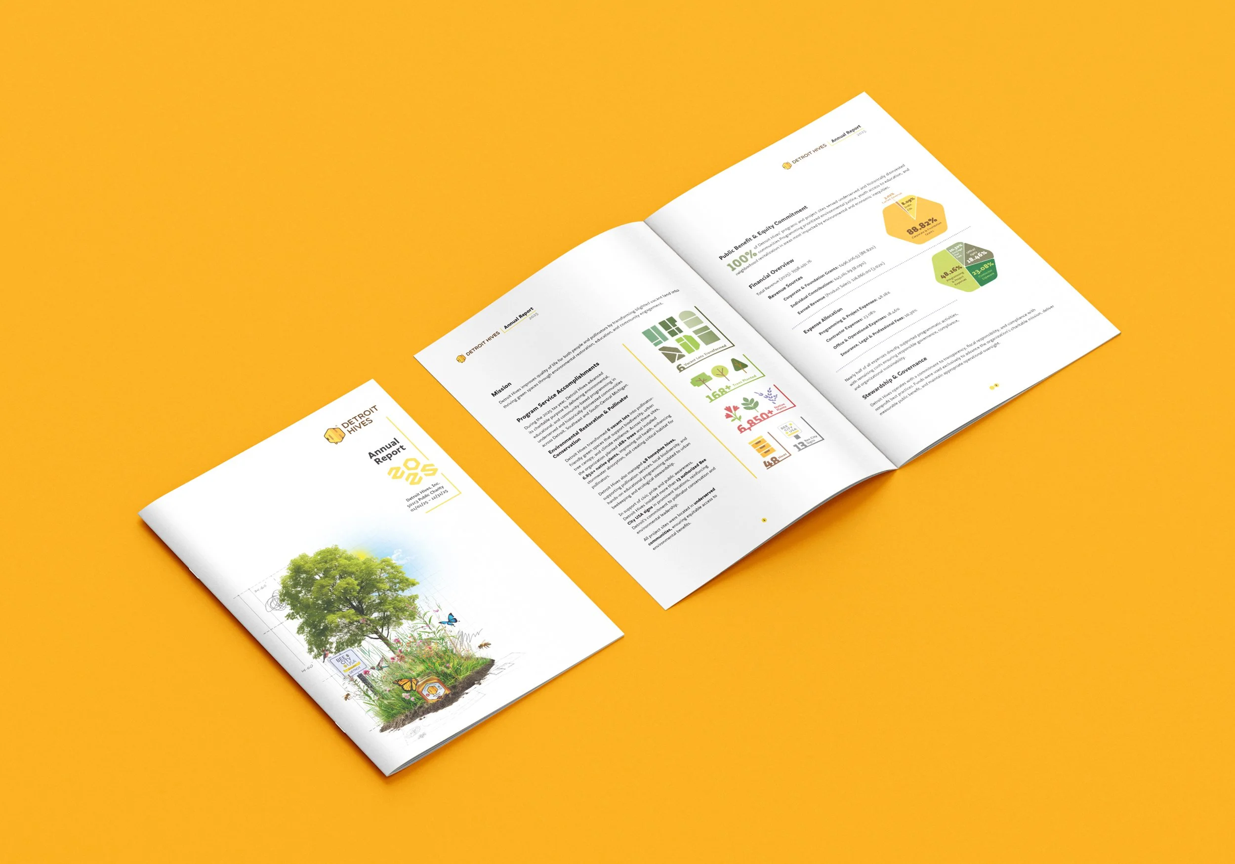
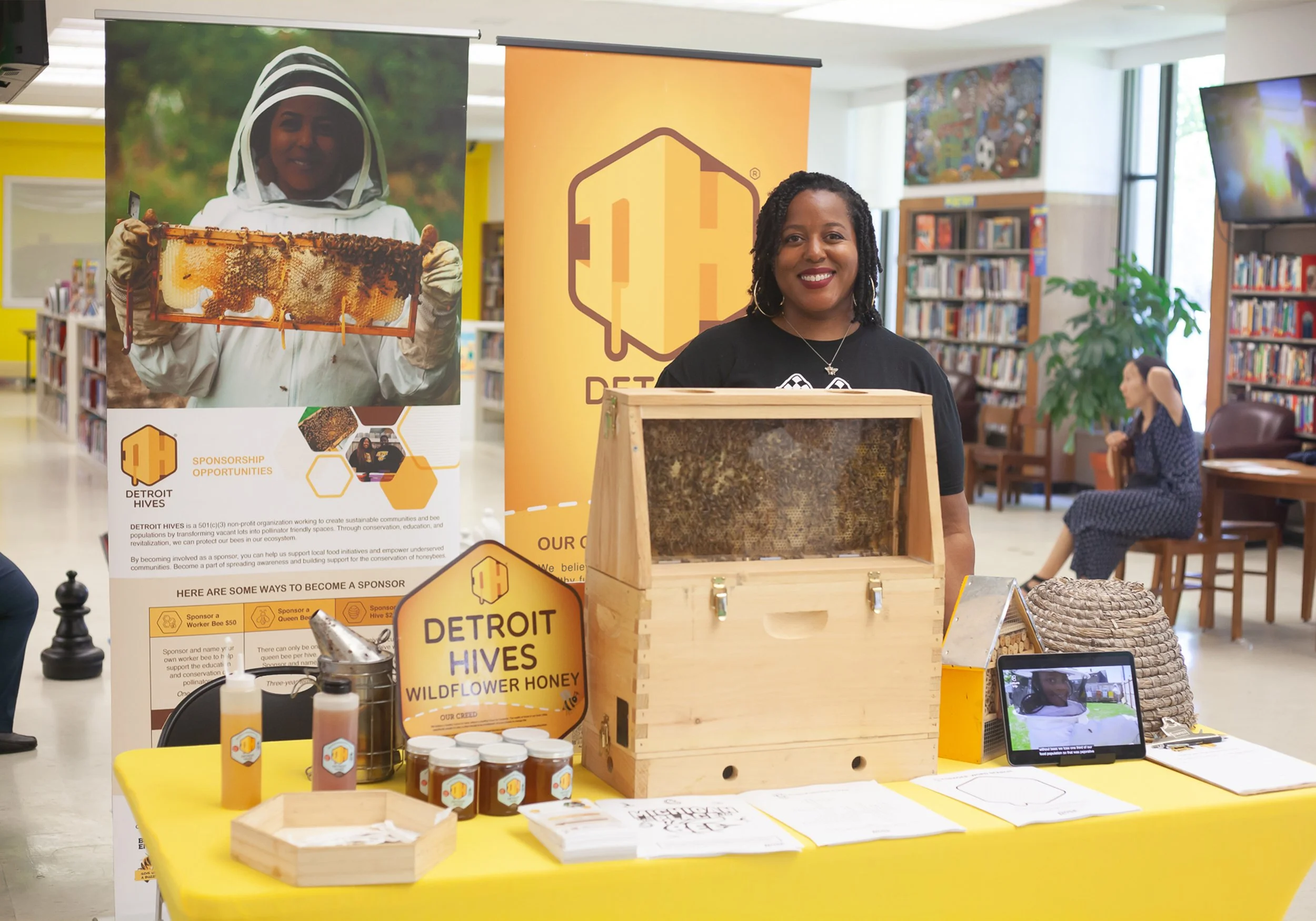
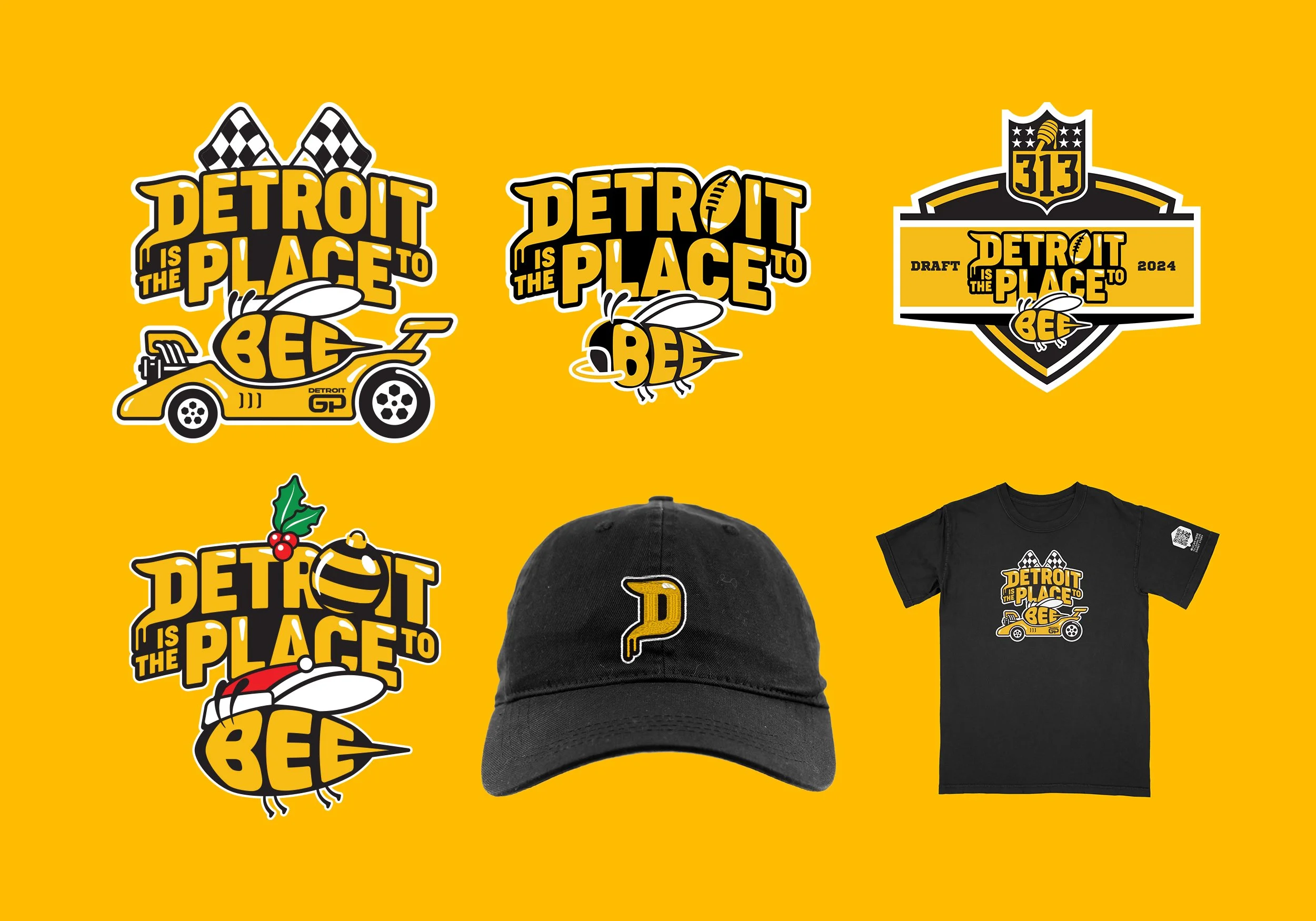
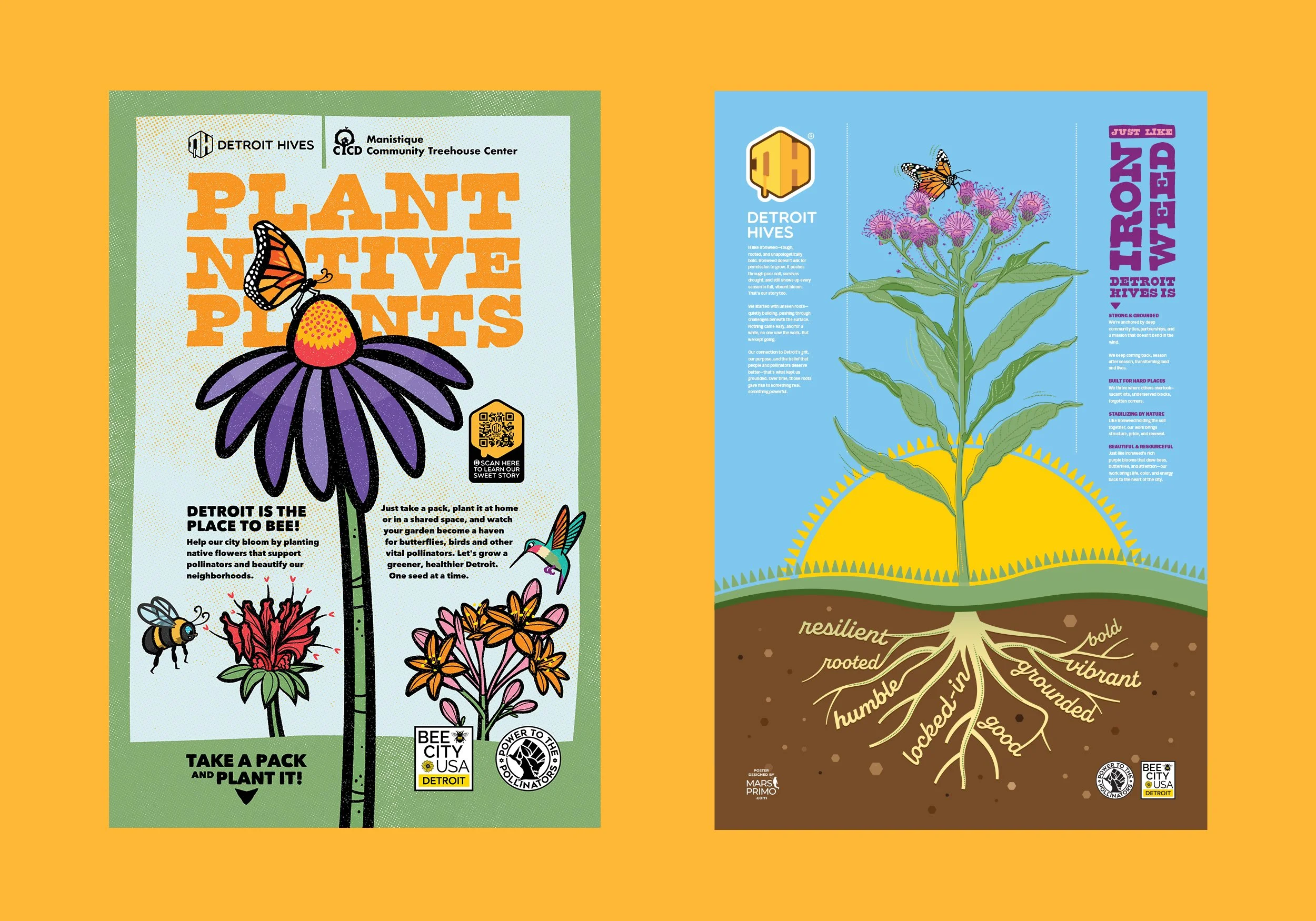
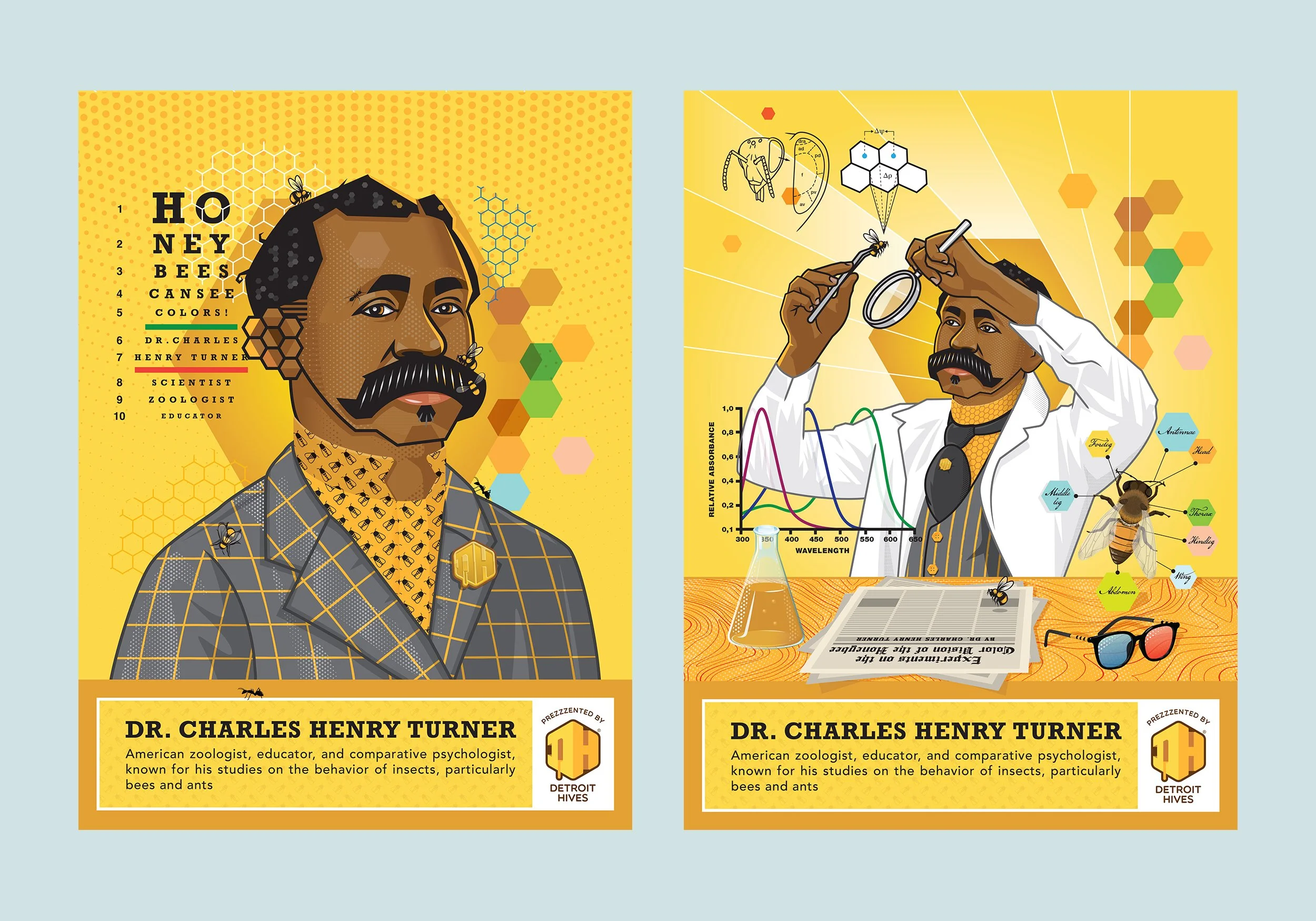
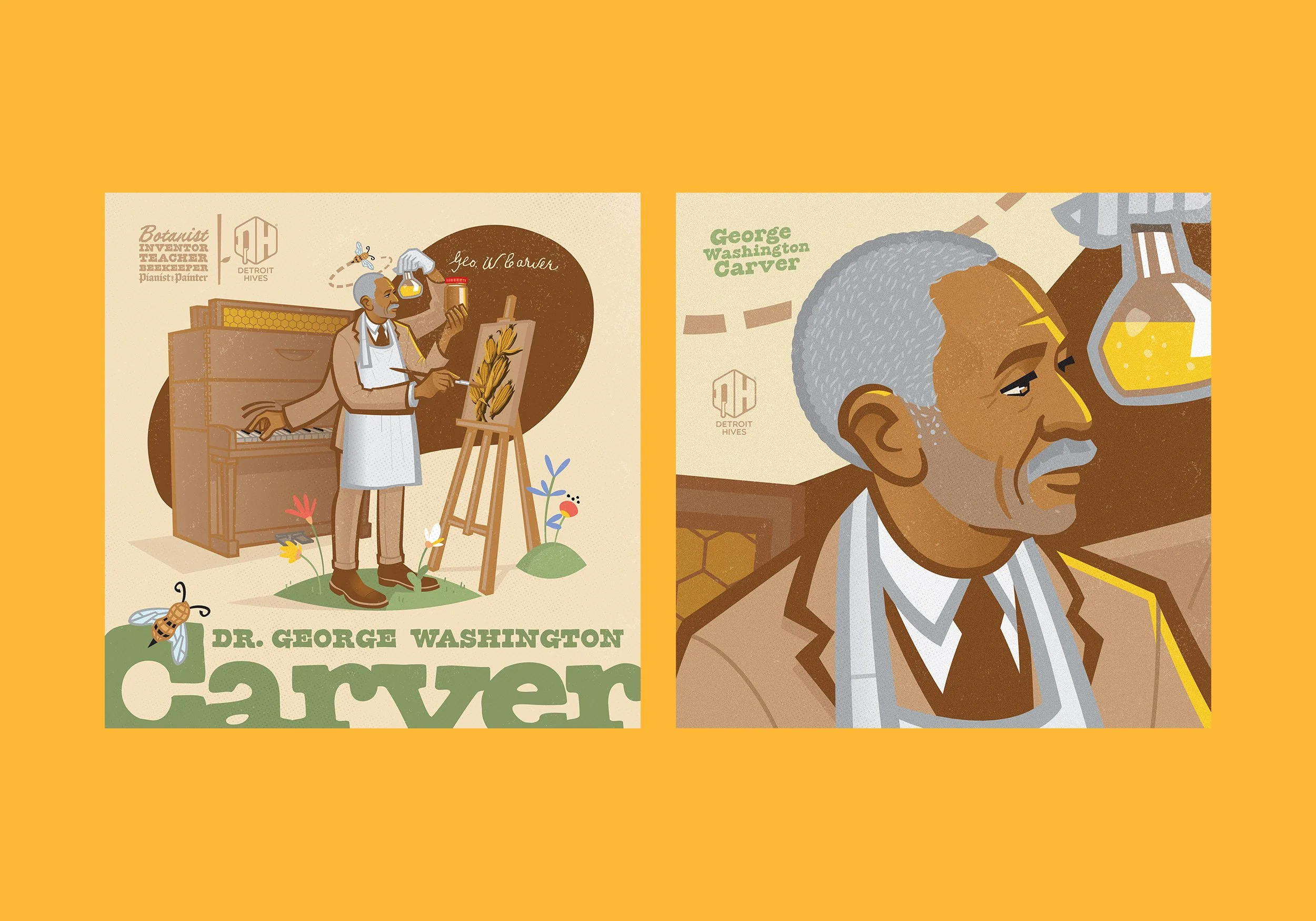
Signage systems for multiple apiaries and gardens. Social media campaigns. Slide decks and sell sheets for funding conversations. Annual reports. Event posters. Merchandise and apparel.
Every touchpoint reinforced consistency.
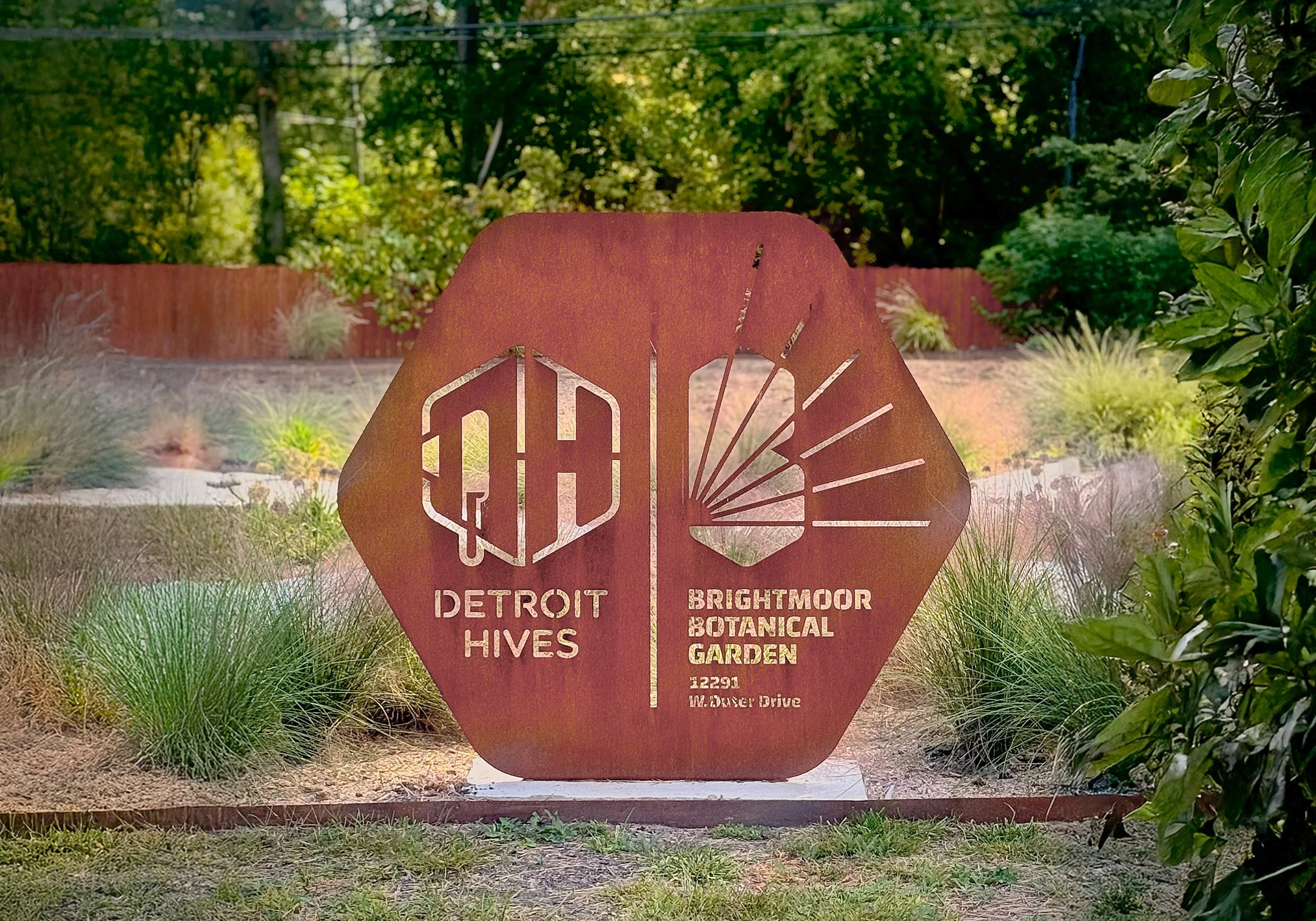
Outdoor signage became particularly significant — visible, permanent, and public. The identity had to hold up in the real world.
ELEVATION
Over time, the brand became recognizable across the city.
Competitors began to imitate the visual system. Grant committees responded to the clarity and structure of presentation materials. Community engagement strengthened through consistent messaging.
The brand did not shout. It stood firm.
-
• Logo system
• Typography system
• Color palette
• Outdoor signage
• Apiary signage
• Event posters
• Social media campaign visuals
• Annual report spreads
• Branded apparelThe system was built for adaptability — able to support both community outreach and institutional communication.
-
Since its founding, Detroit Hives has:
Transformed six vacant lots into pollinator-friendly green spaces
Planted over 168 trees and 6,580 flowers
Managed 48 active hives
Earned Bee City designation
Generated $558,491.76 in revenue (2025)
While design alone does not create impact, a disciplined visual system strengthens perception, trust, and communication — all essential to growth.
From grassroots beginnings to city-recognized organization, the brand has grown alongside the mission.
-
Detroit Hives began with vacant land and a clear vision.
“From nothing” doesn’t mean from emptiness — it means starting honest and building deliberately.
Built with intention.
Made with Marcus.