Good Guys
Brand Identity System
-
Good Guys Towing & Recovery is a Charlotte-based startup built on a simple premise: be dependable, transparent, and genuinely helpful in moments when people need it most.
Commissioned by the founder, I developed a full brand identity system designed to help the company stand apart in an industry saturated with aggressive, utilitarian visuals.
The objective was not to look loud—but to look trustworthy.
-
The towing industry is visually predictable.
Most competitors rely on literal imagery — tow trucks, chains, hooks, flames, heavy industrial typography.
The result? Homogenous branding that communicates force and machinery — but rarely personality.
Good Guys wasn’t built on force. It was built on people.
Without a differentiated identity, they risked blending into the noise.
-
They didn’t need another truck silhouette.
They needed distinction through character.The opportunity was to position Good Guys as:
• Friendly in moments of stress
• Reliable without intimidation
• Professional without coldness
• Transparent and promptInstead of selling towing services — which are largely uniform —
we chose to sell personality, trust, and relatability. -
CLARITY
We defined the core positioning:
Good Guys leads with character.The brand would emphasize reliability, professionalism, and approachability — not mechanical toughness.
The visual language needed to feel:
• Clean
• Confident
• Memorable
• HumanCARE
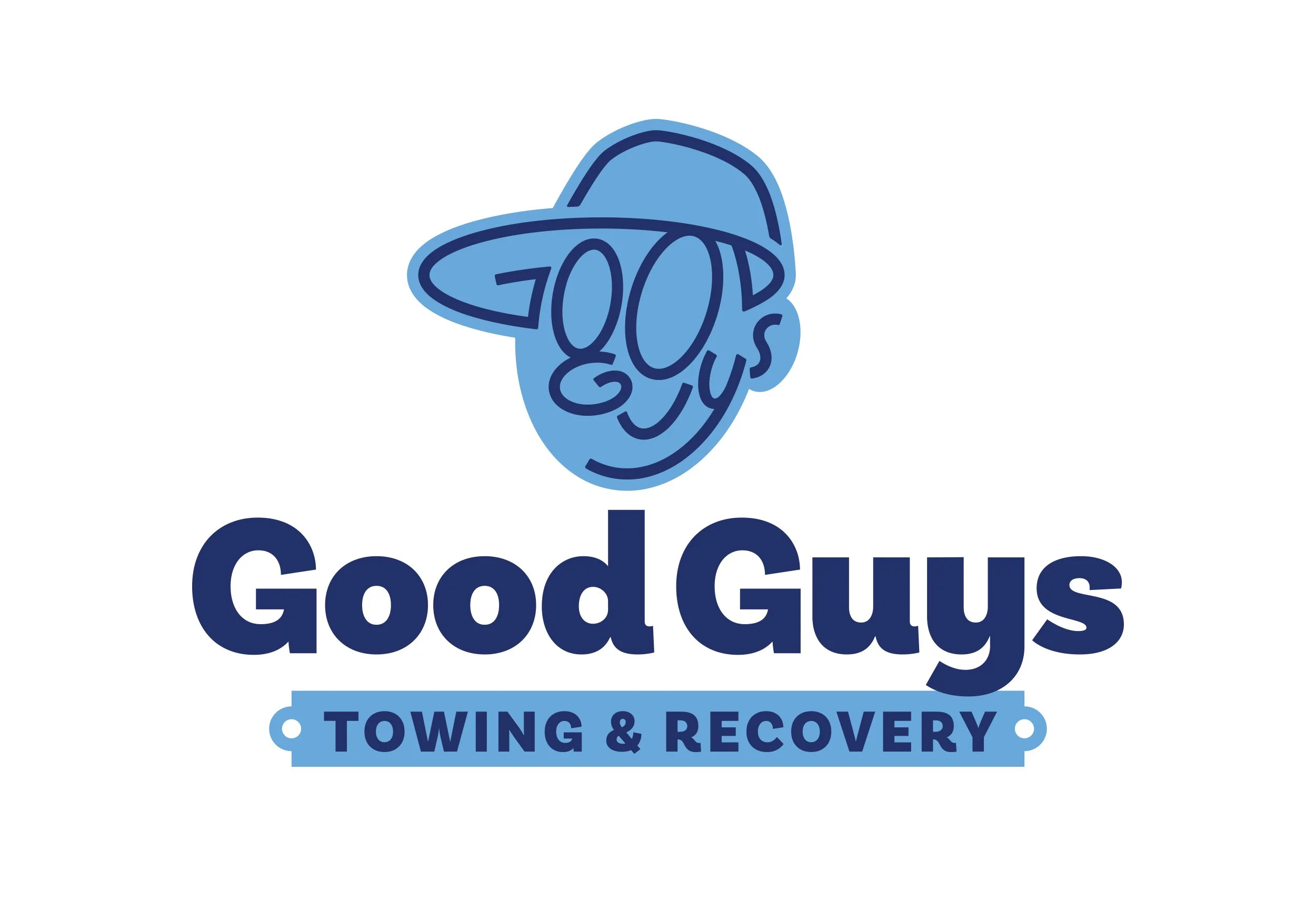
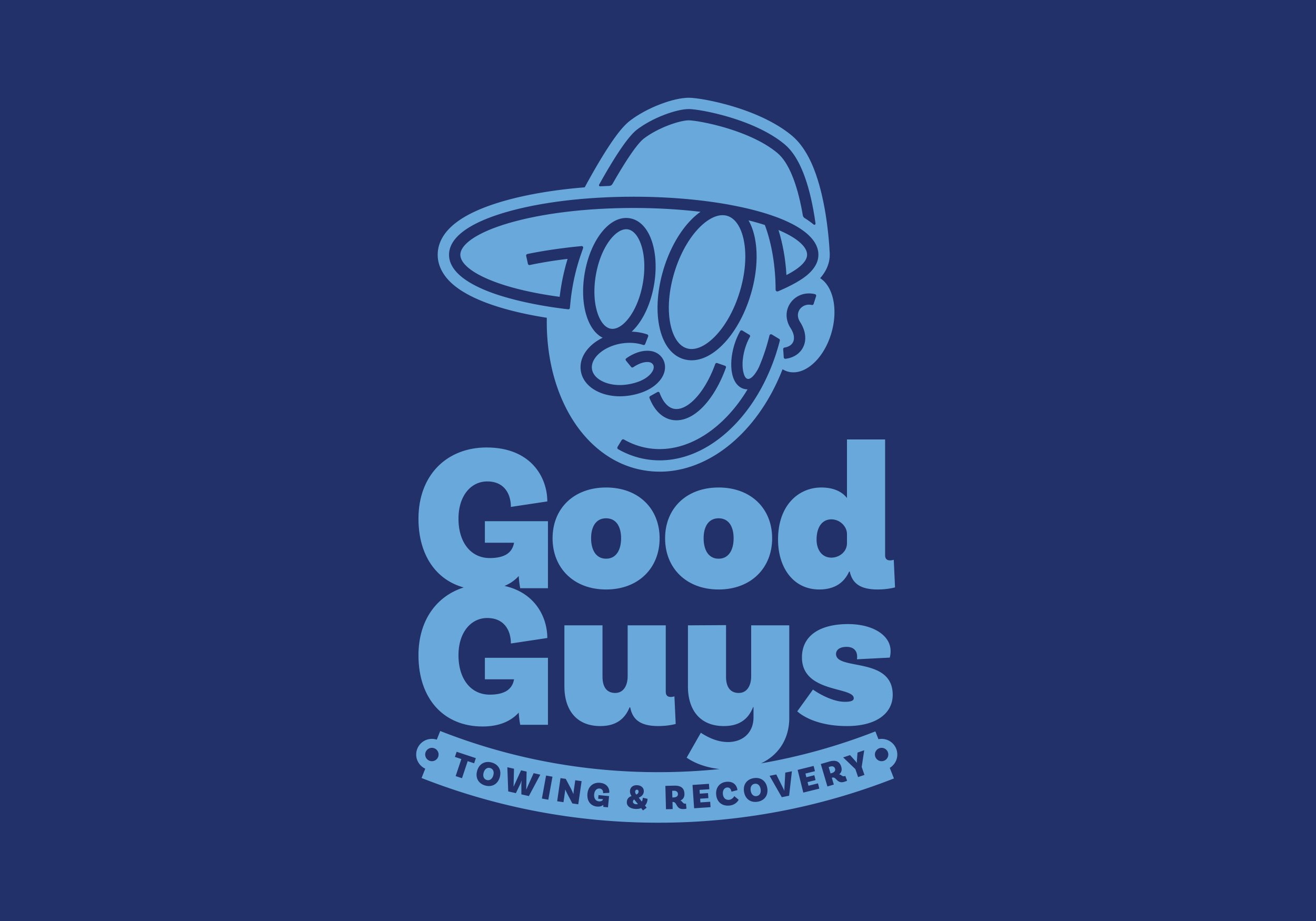
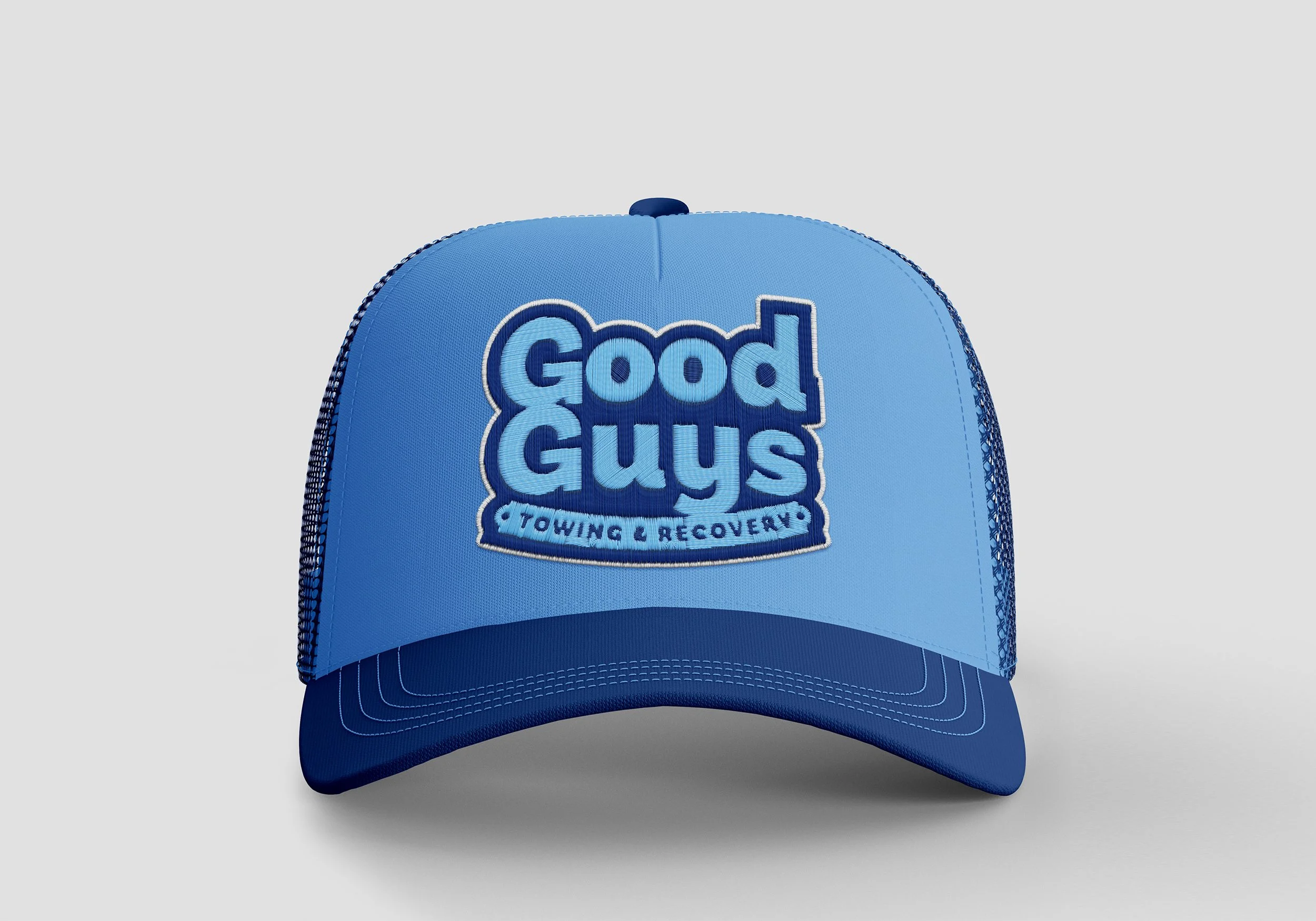
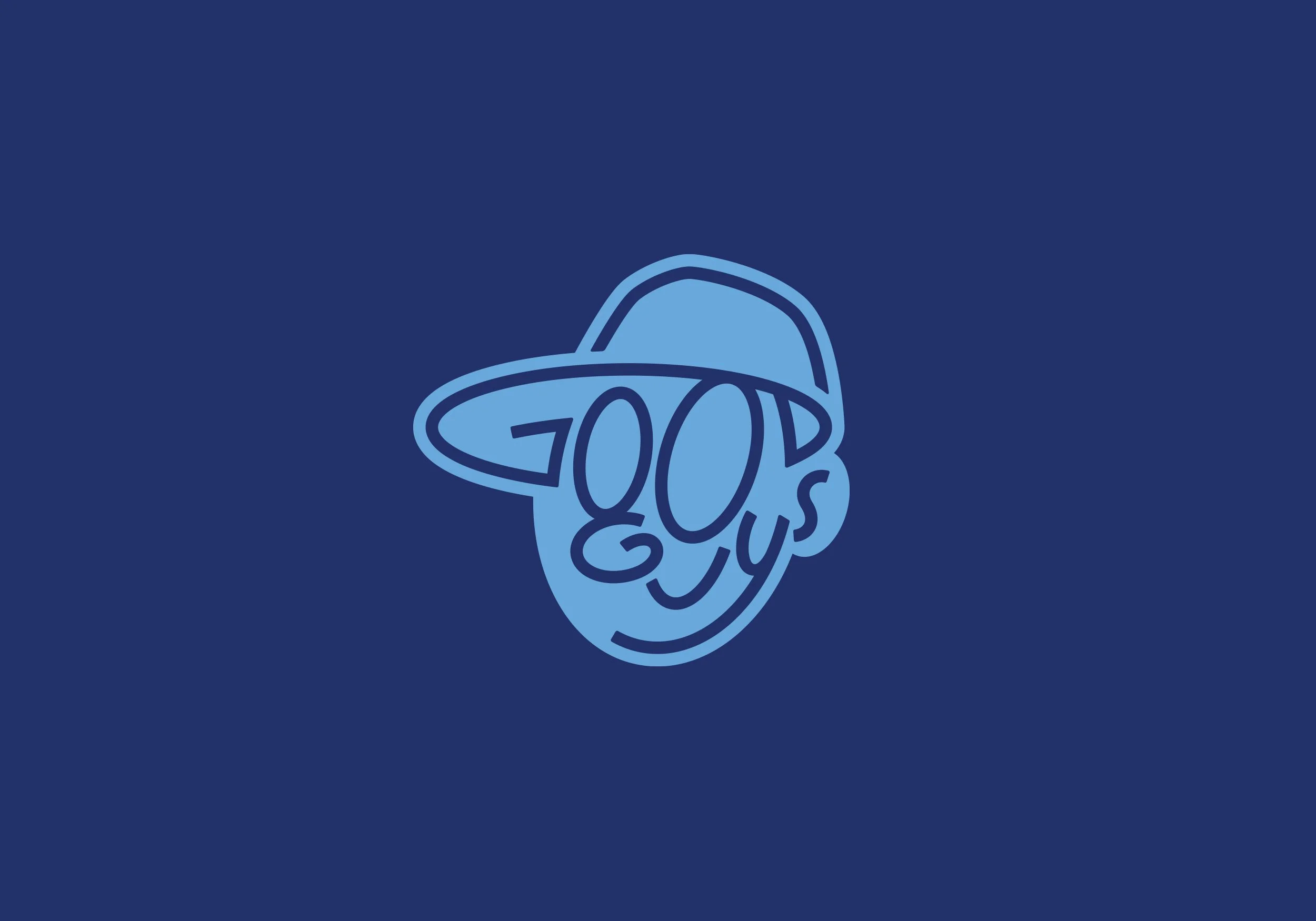
Rather than defaulting to industry clichés, I developed a typographic solution using the full “Good Guys” wordmark itself.
Every letter was intentionally configured to form a smiling face wearing a trucker hat, allowing the name to become the symbol.
This approach accomplished several things simultaneously:
• Immediate memorability
• Emotional warmth without cartoonish excess
• A distinct departure from industry tropes
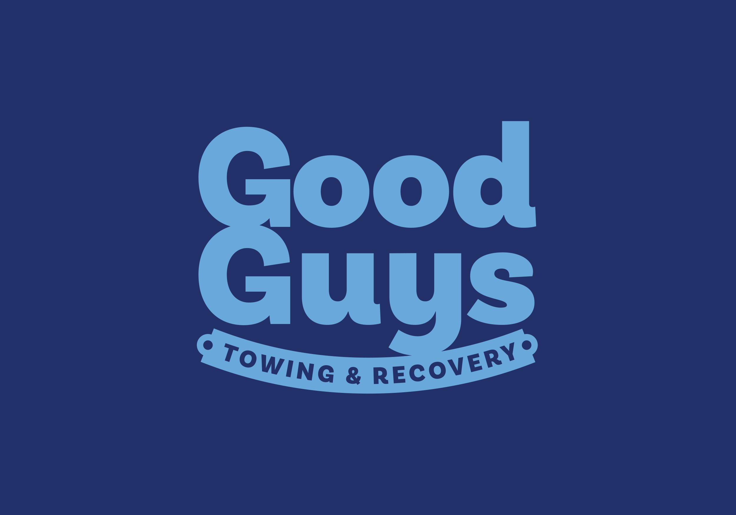
• A scalable mark that functions as both logo and iconBy building the face directly from the brand name, the identity feels cohesive and ownable — not decorative or applied. The typography doesn’t sit beneath the mark. It is the mark.
The result is a brand that communicates personality and professionalism in a single, unified gesture.
ELEVATION
Instead of looking like another towing operation, Good Guys emerged with a brand that felt intentional and human.
The identity communicates trust before a single word is spoken.
It positions the company as approachable in stressful situations — a meaningful differentiator in roadside recovery services.
The brand is simple. But simplicity, executed deliberately, creates presence.
-
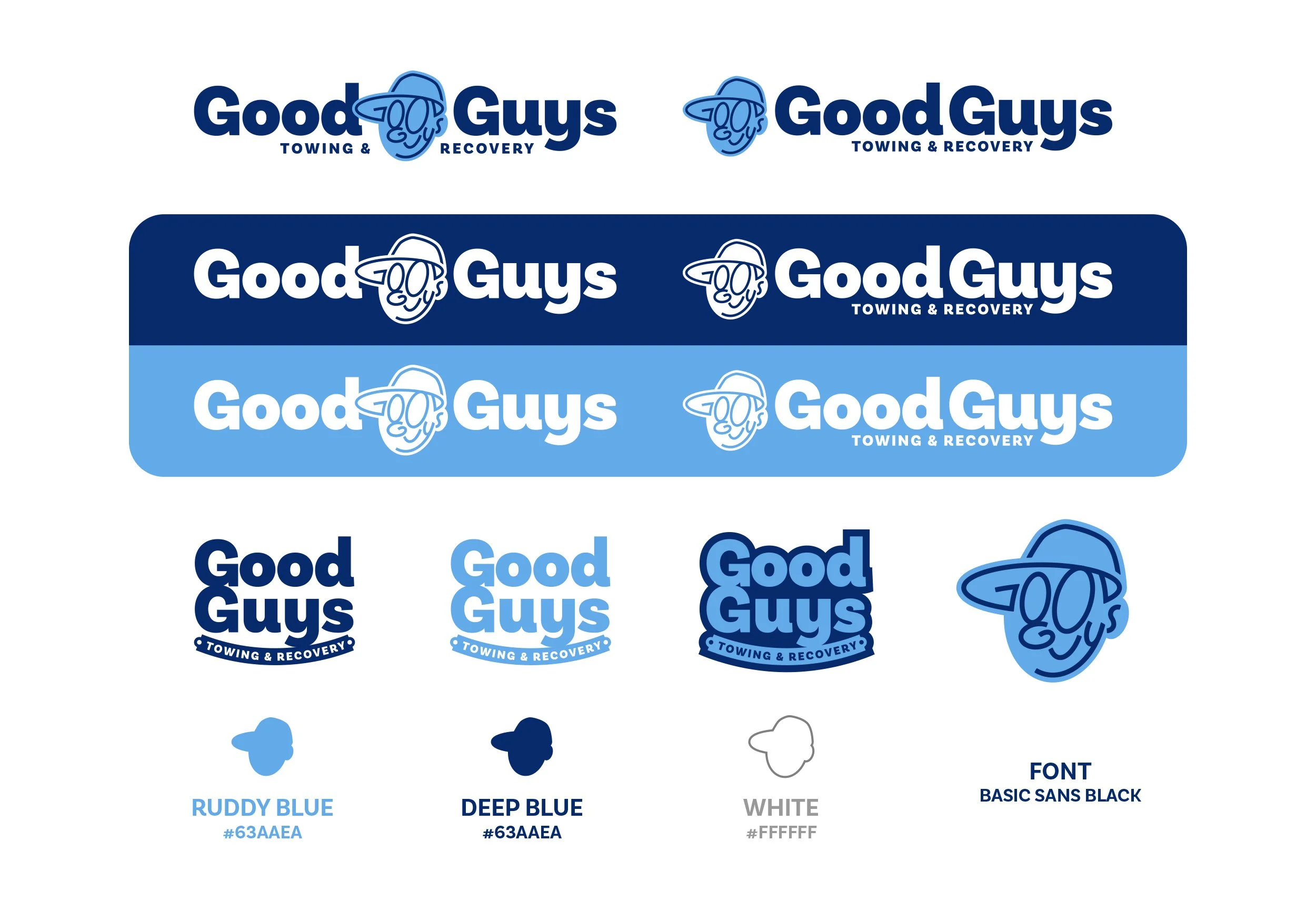
• Primary logo with smile mark
• Alternate lockups
• Monochrome applications
• Color system
• Typography hierarchy
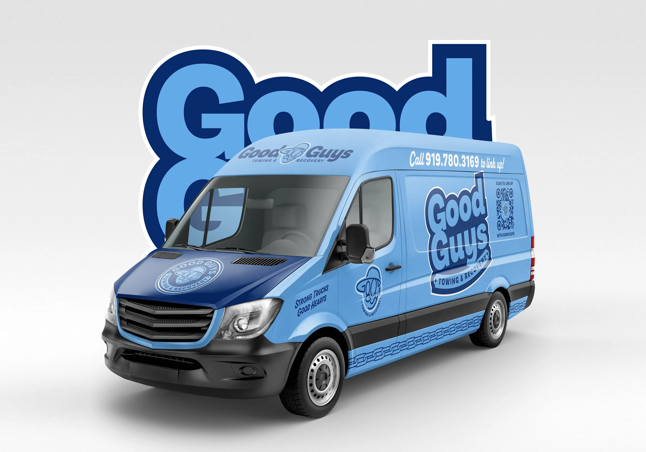
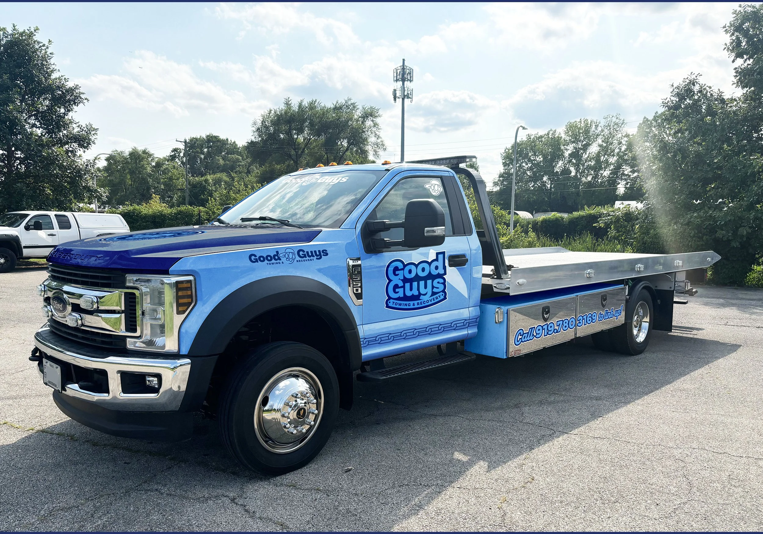
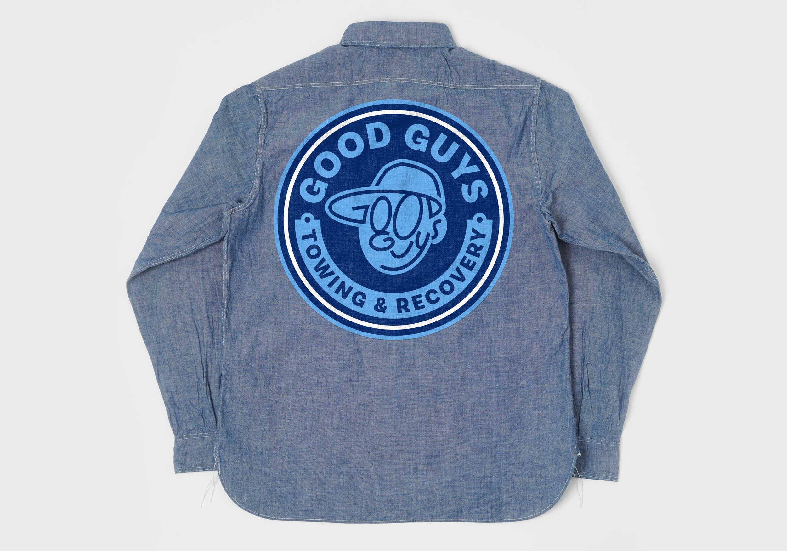
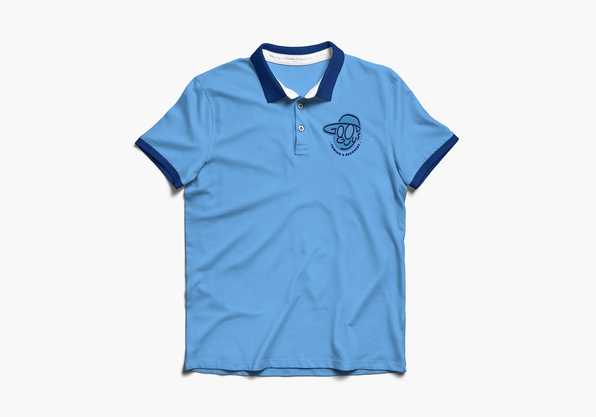
• Truck mockups
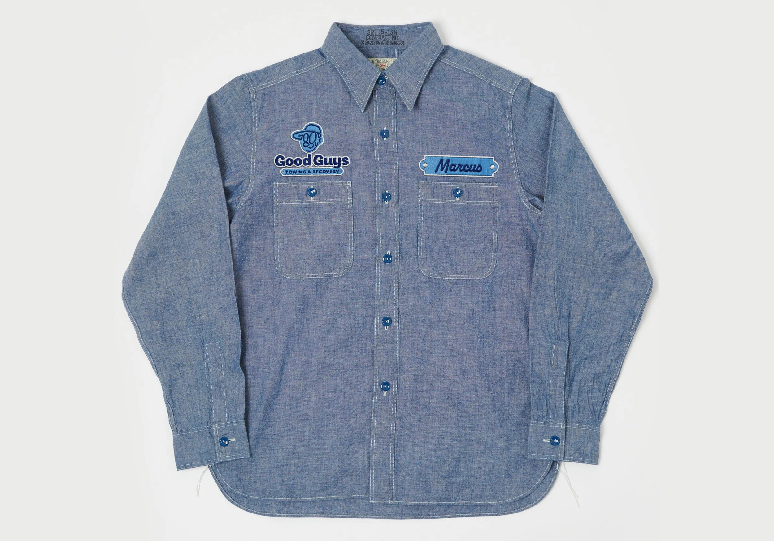
• Apparel and uniform applications
• Business cards and signageThe system was built to function across vehicles, uniforms, digital platforms, and marketing materials without losing clarity.
-
Good Guys launched not as another towing company —
but as a recognizable, personality-driven brand.By leading with trust and relatability, the identity reframes the customer experience from transactional to human.
In an industry defined by machinery, the brand sells character.
-
Differentiation doesn’t always require complexity.
Sometimes it requires restraint — and the courage to position differently.
Built with intention.
Made with Marcus.