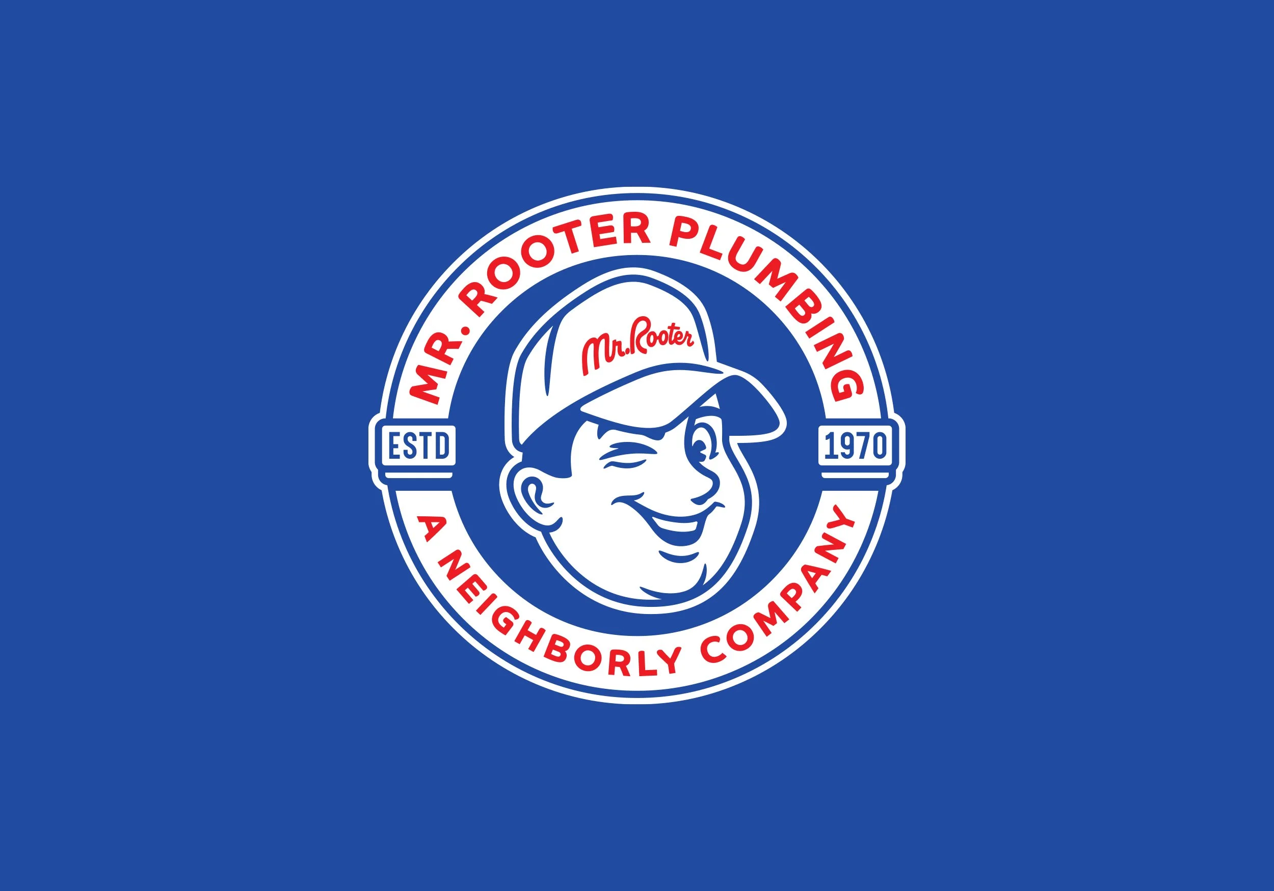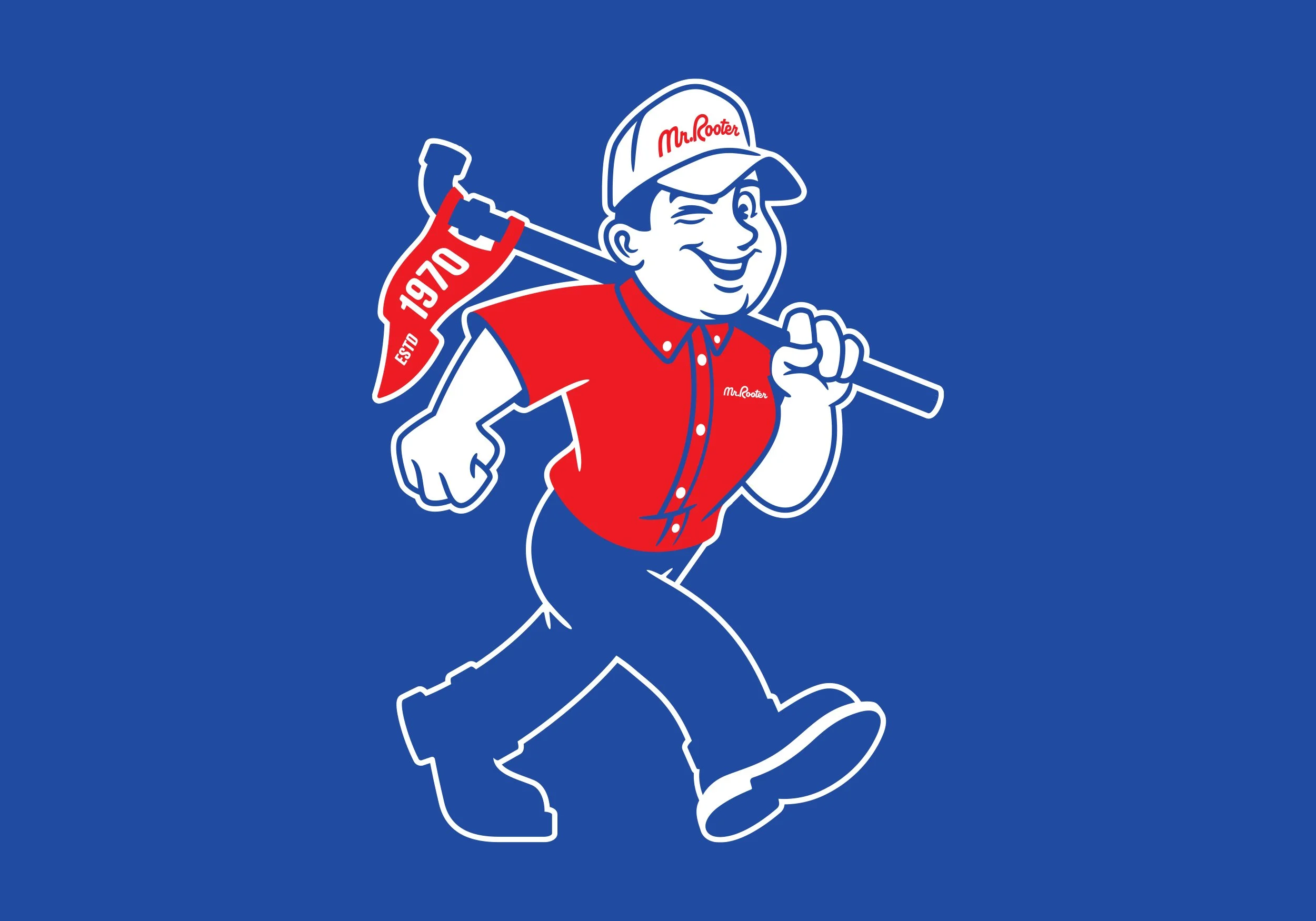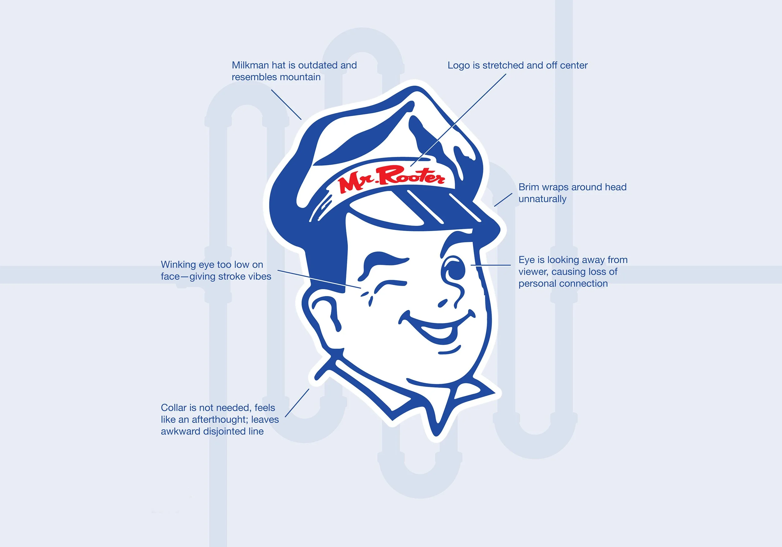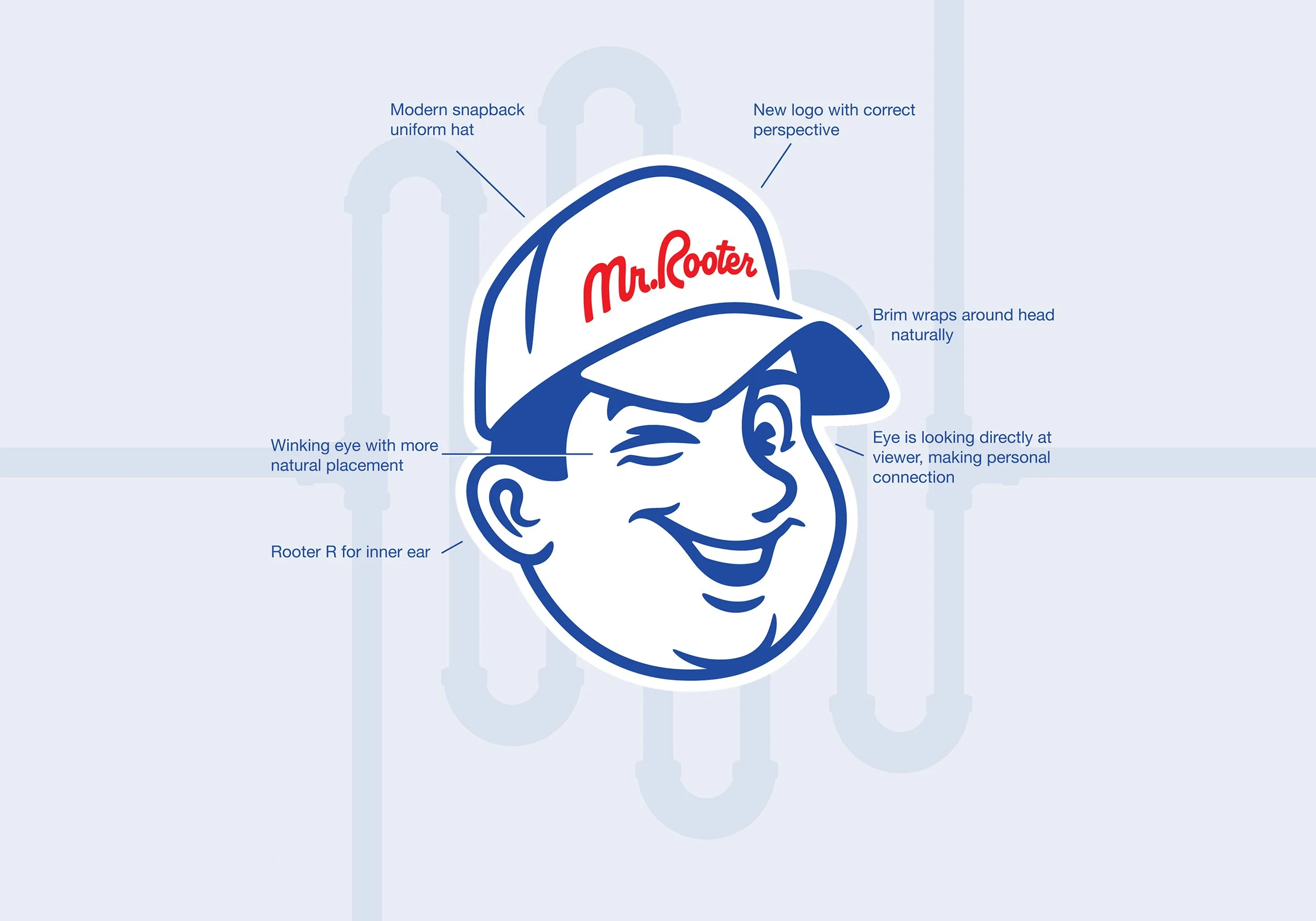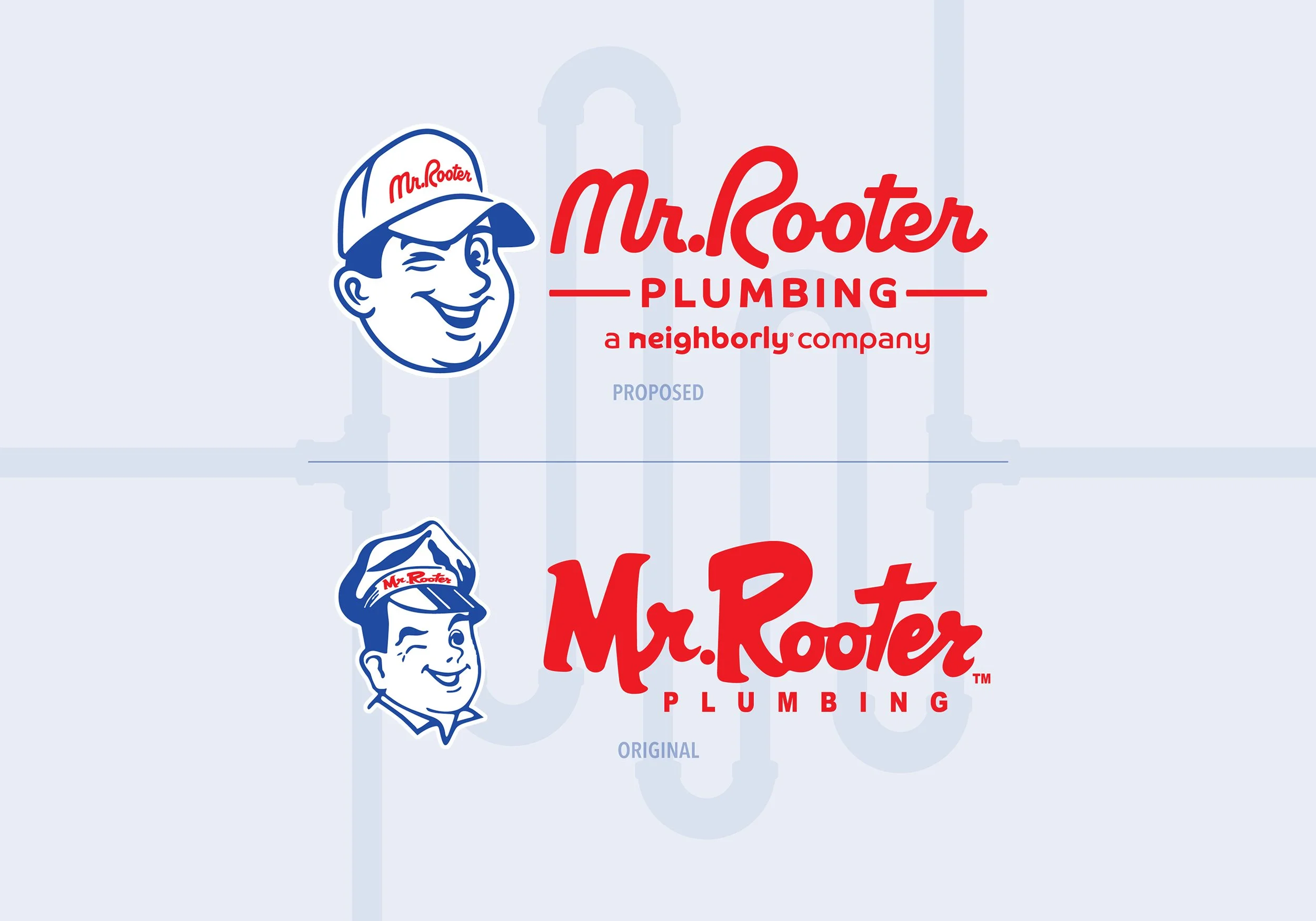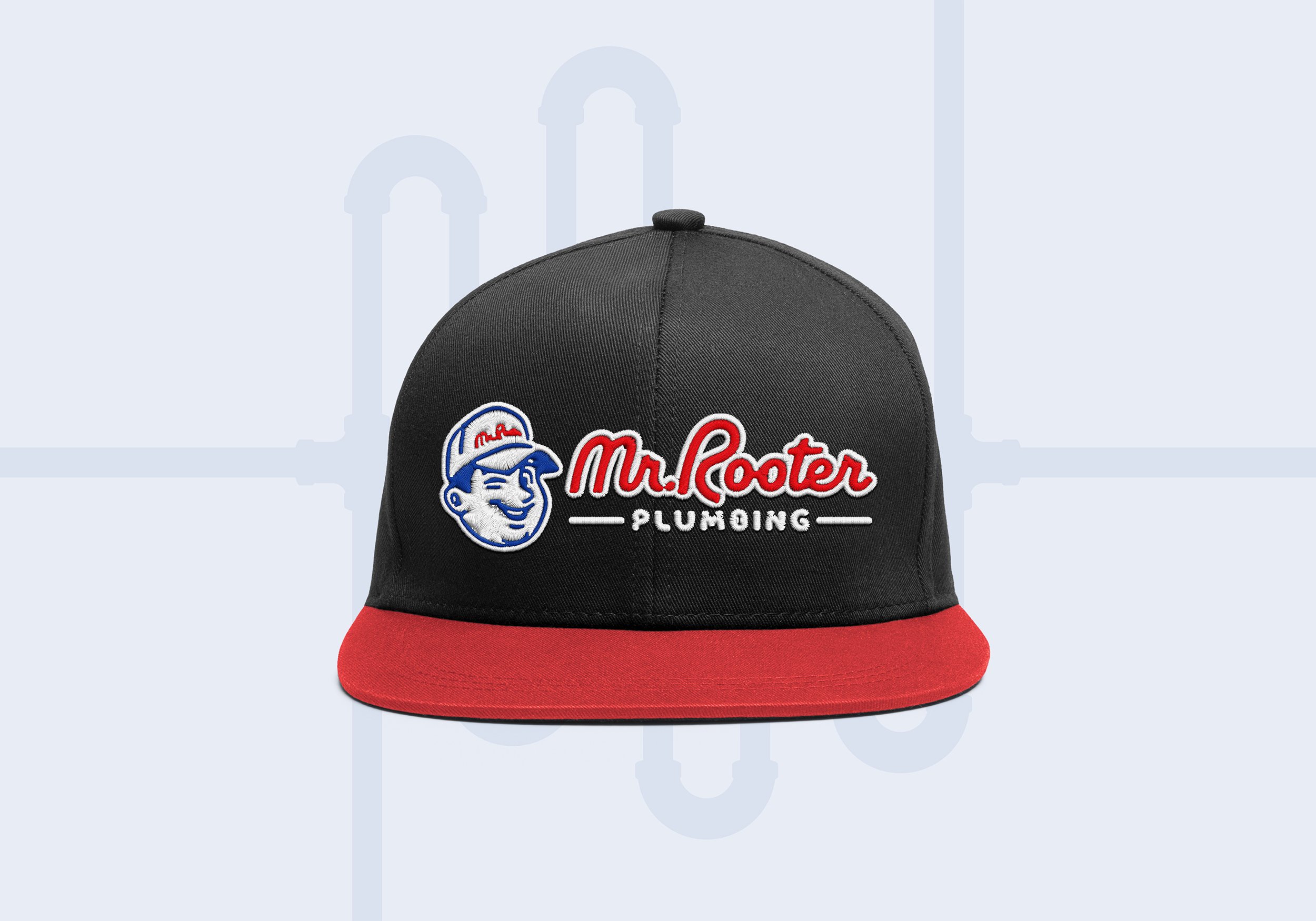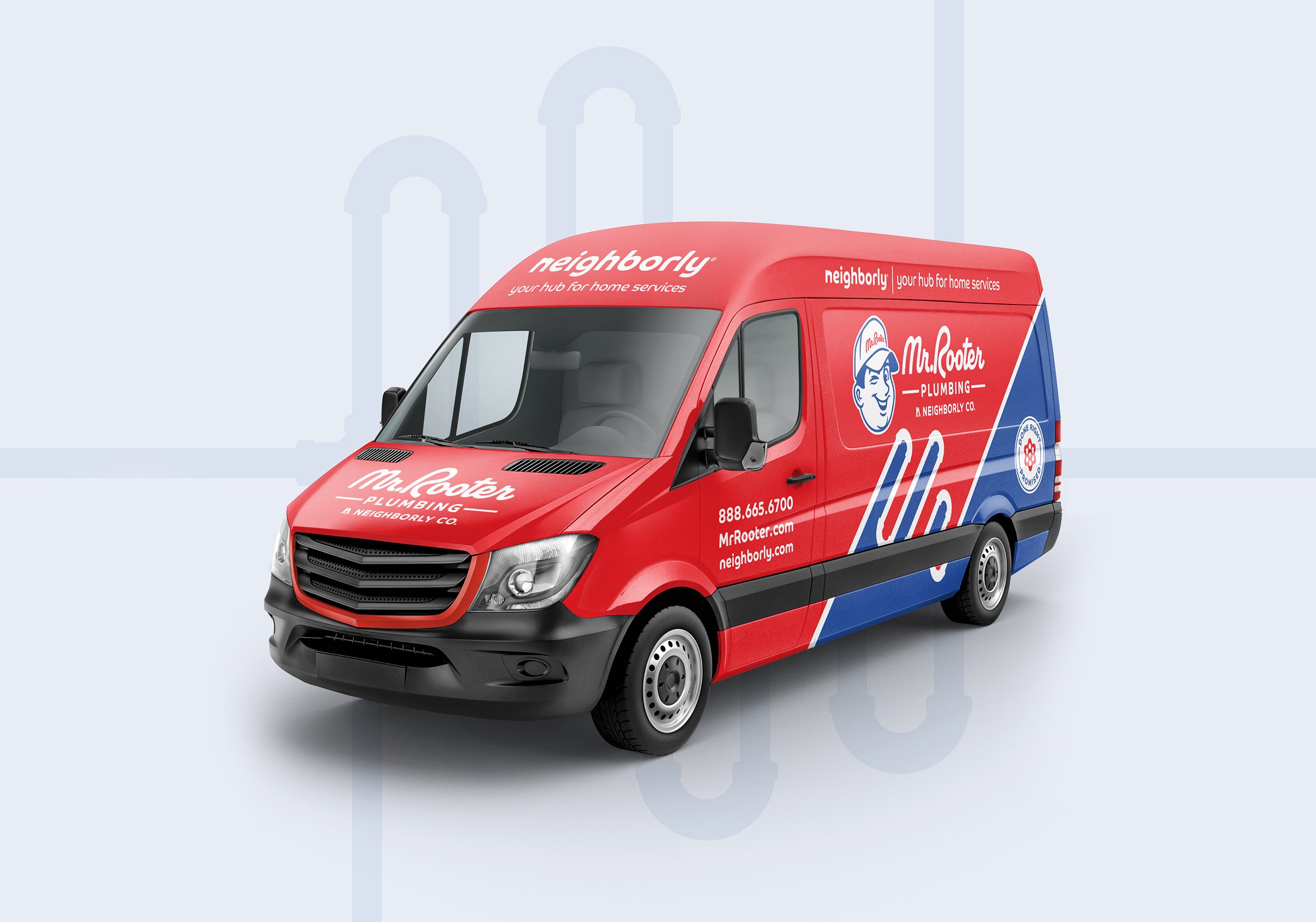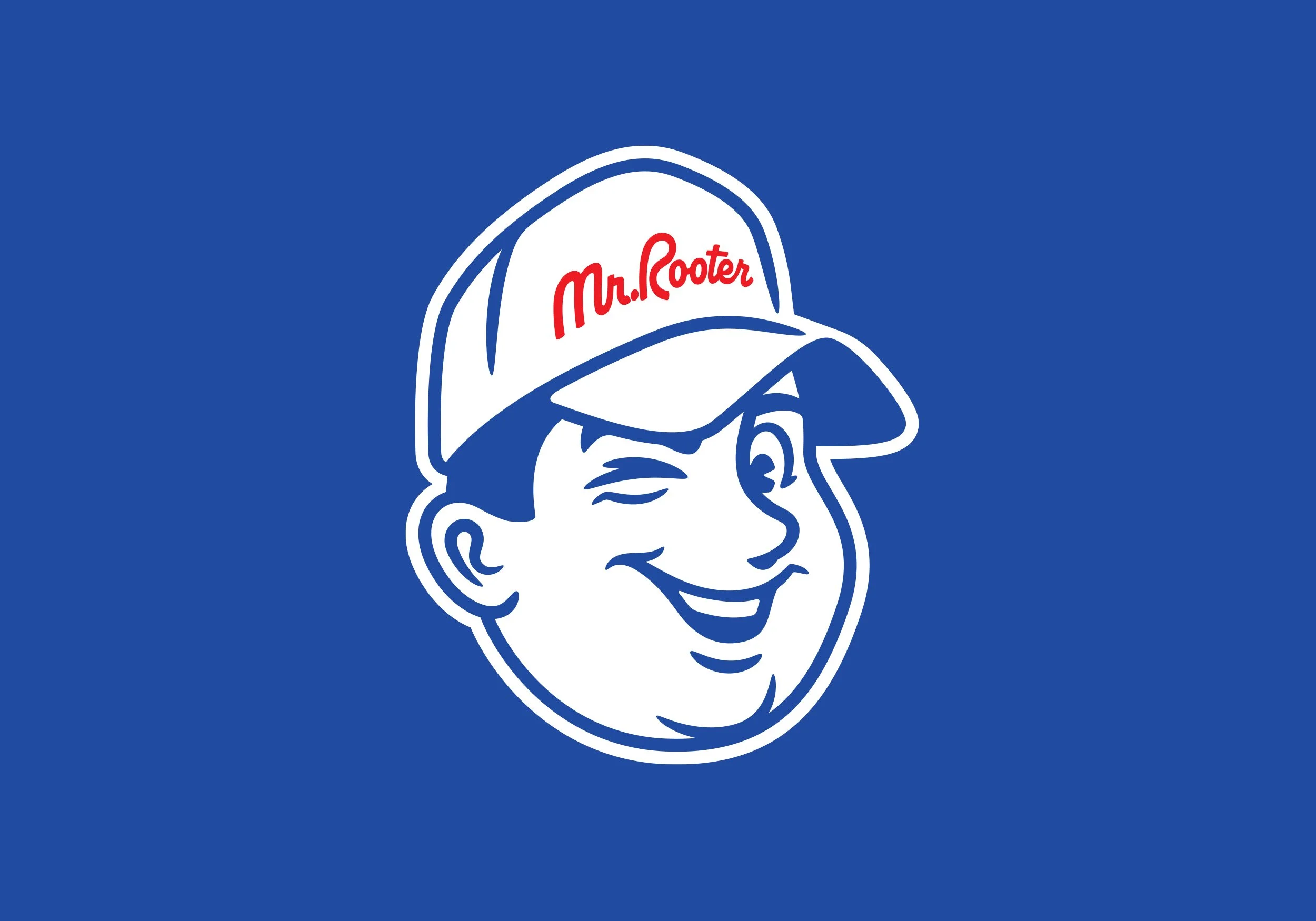
MR. ROOTER’S PLUMBING (PROPOSED)
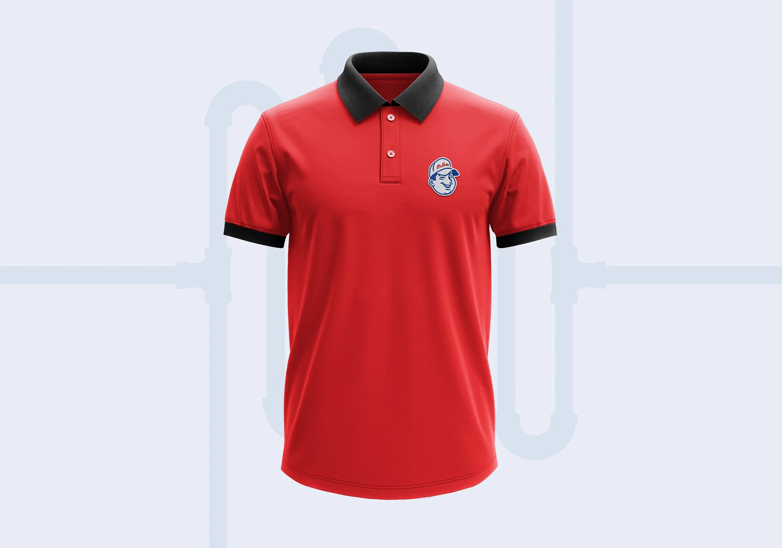
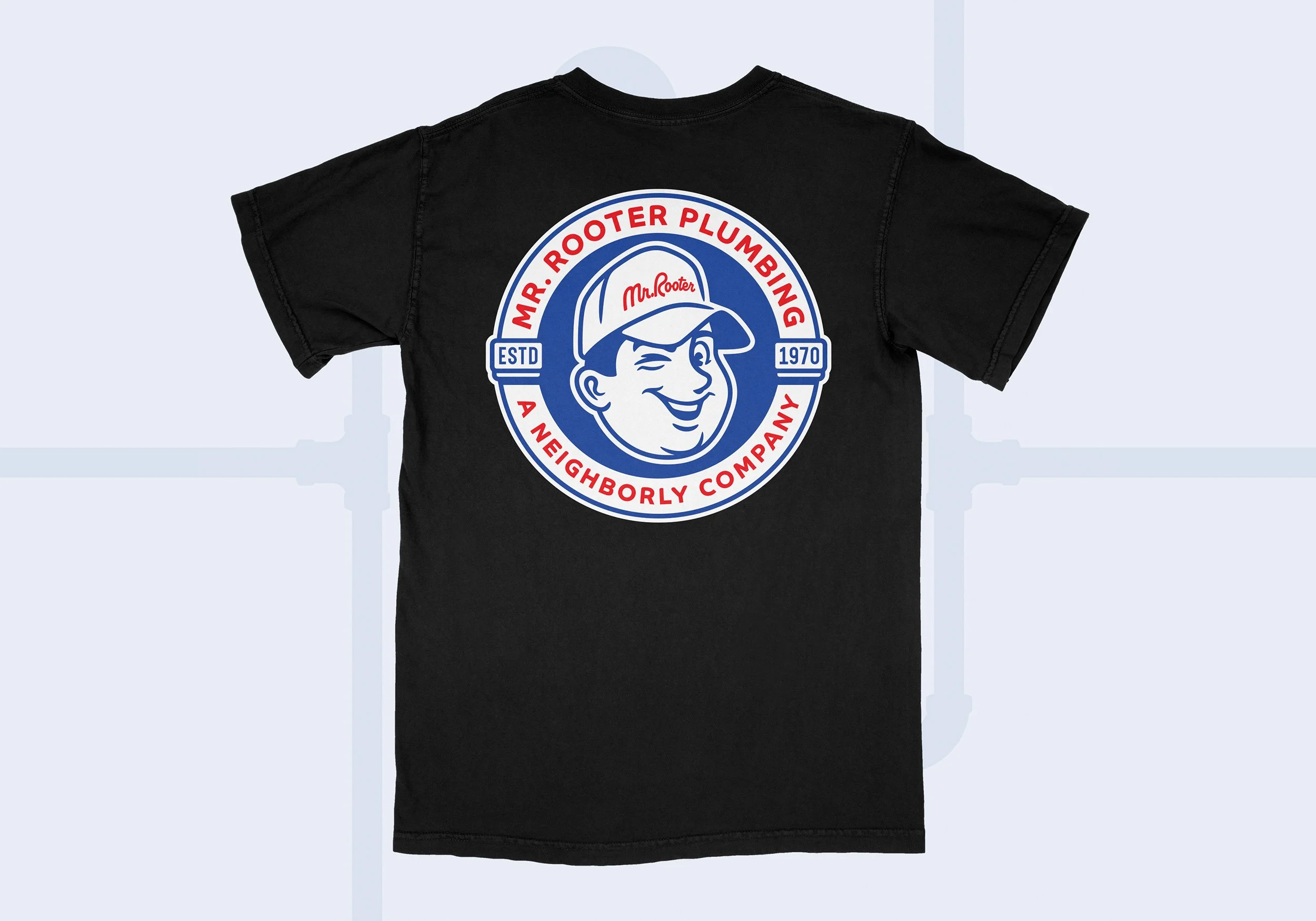
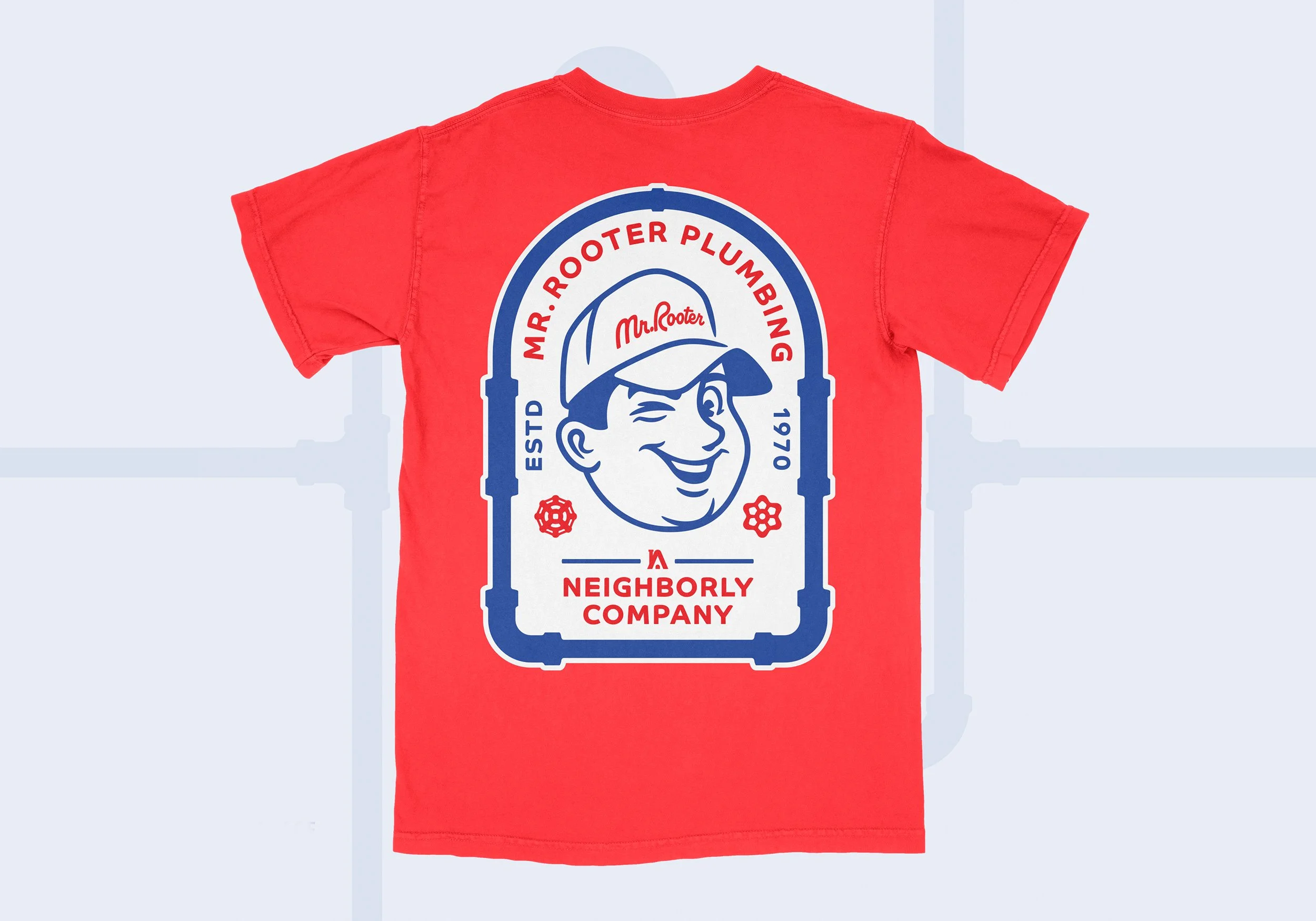
Mr. Rooter carries decades of brand equity, but its current mark feels visually dated and structurally inconsistent. I reimagined the identity with the goal of modernizing the character while preserving the familiarity that customers recognize. The updated logo refines proportion, perspective, and expression — creating stronger eye contact, cleaner geometry, and a more natural hat silhouette. I also developed a responsive family of marks to ensure consistency across digital, vehicle graphics, uniforms, and small-scale applications. The result is an evolution that honors the brand’s legacy while reintroducing it with clarity and confidence for today’s market.